123Flowers is a UK flower delivery brand known for affordable bouquets and gifting. As Lead Graphic & Motion Designer, I refreshed the visual identity and developed a design system that could scale across everything from packaging and emails to large-scale marketing campaigns.
YEAR
2025
ROLE
LEAD GRAPHIC & MOTION DESIGNER
RESPONSIBILITIES
BRAND VISUAL IDENTITY
DESIGN SYSTEM
DESIGN APPLICATION
About the project
GOAL
This project was all about refreshing the brand and bringing it up to date.
SOLUTION
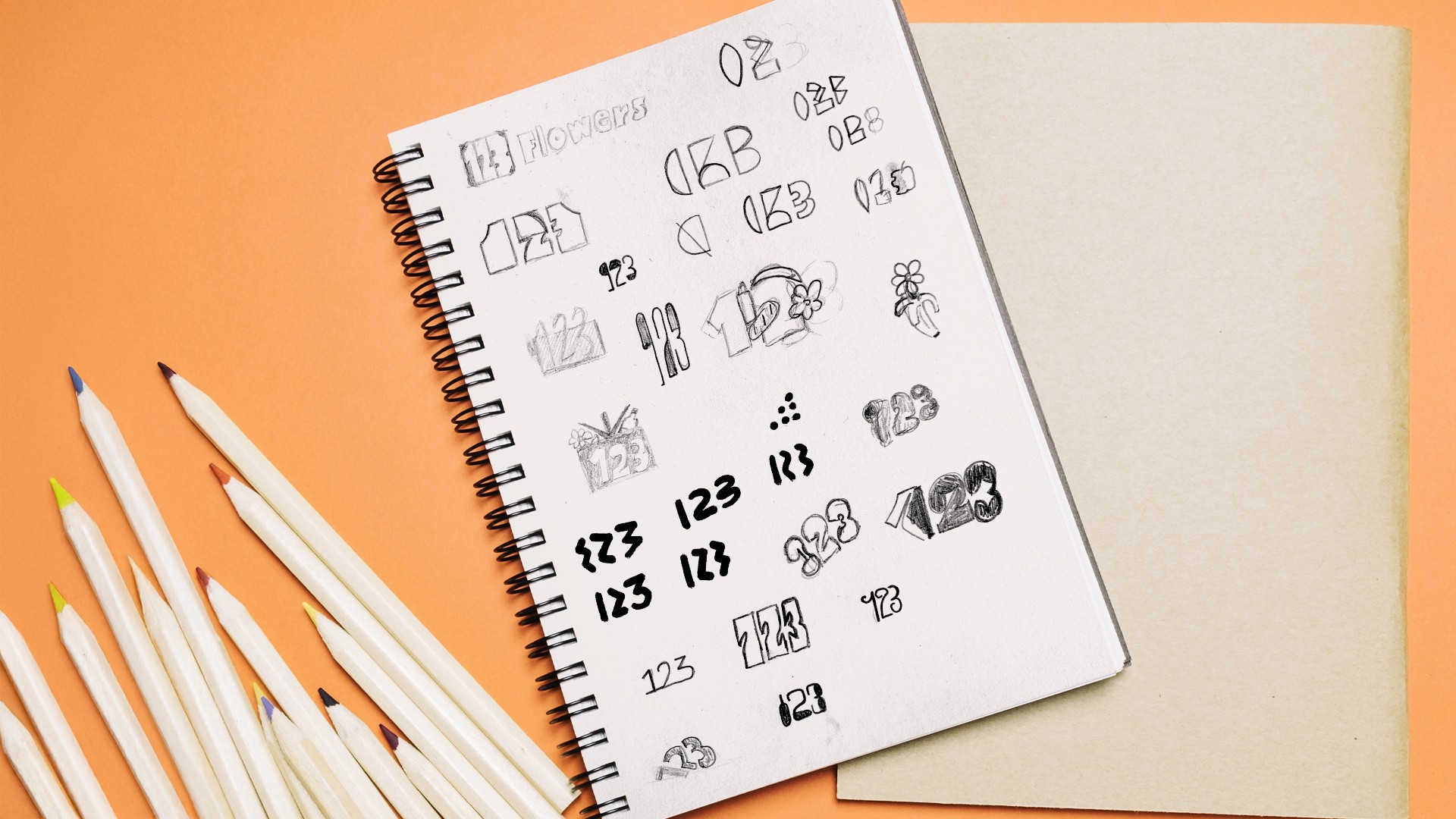
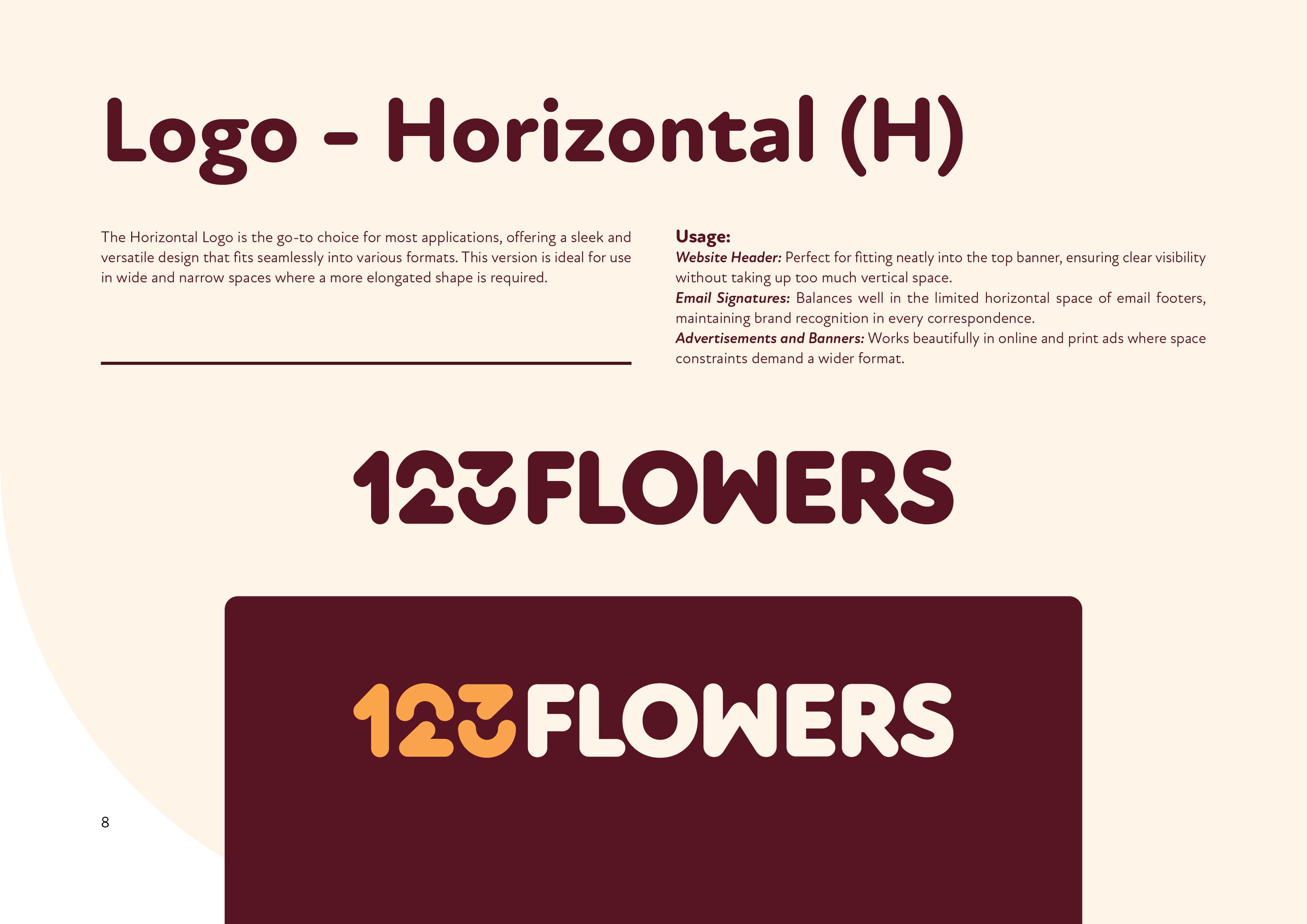
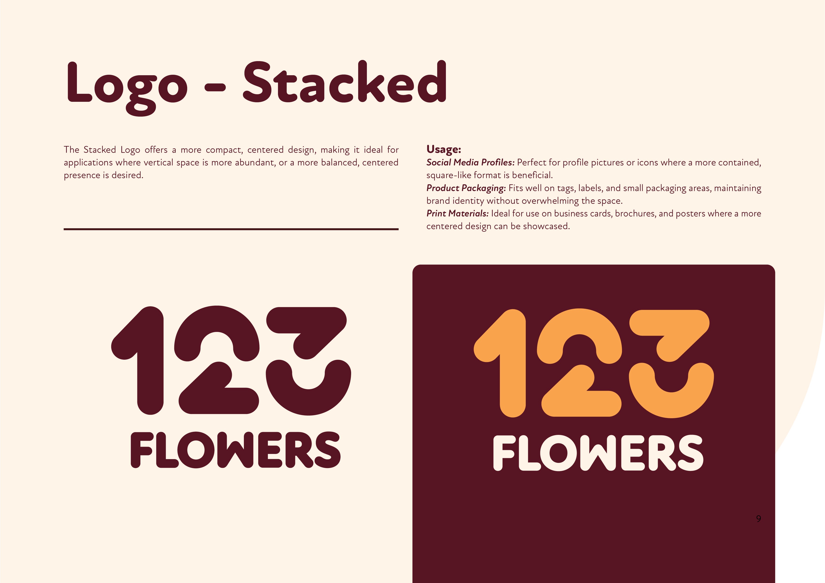
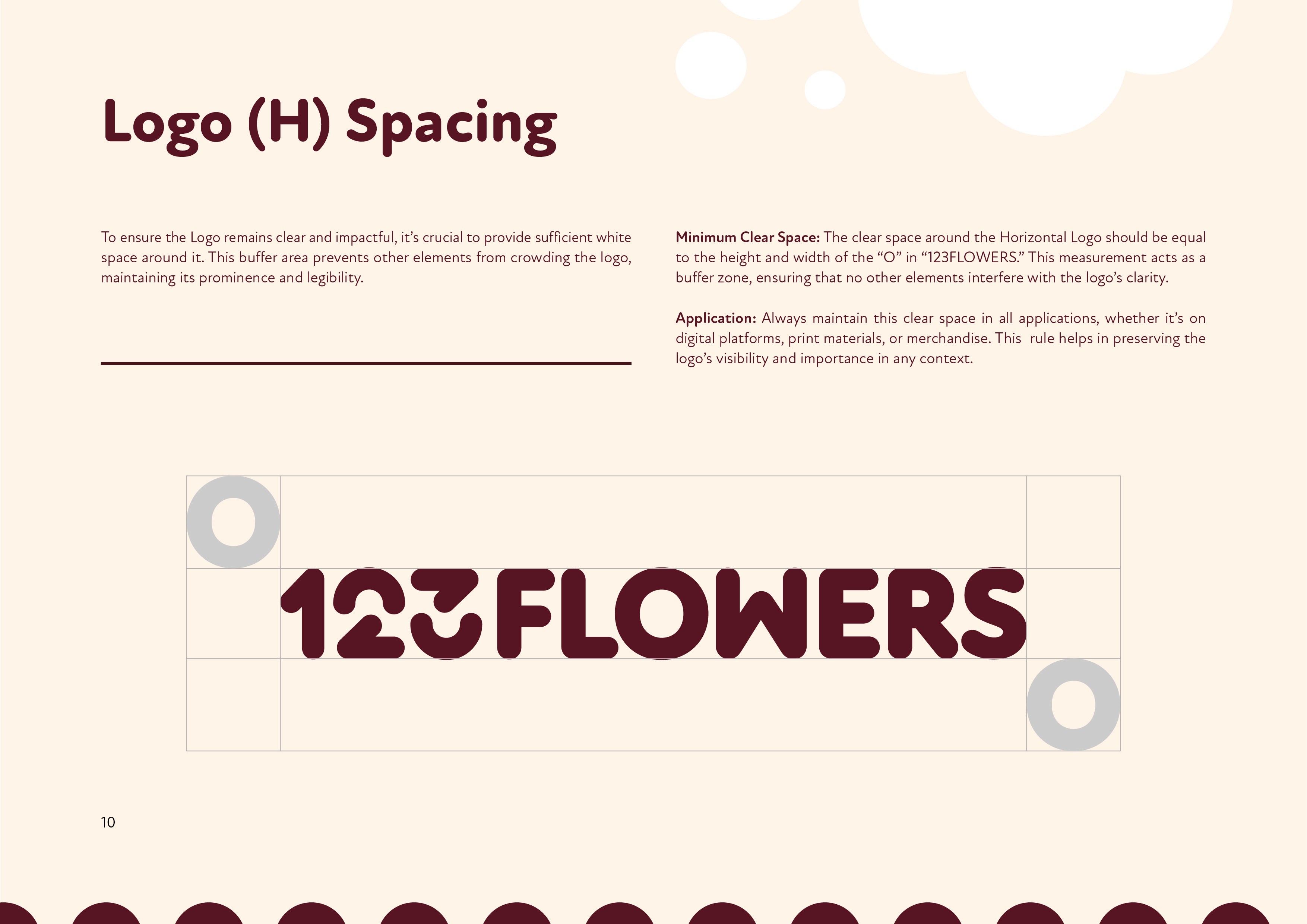
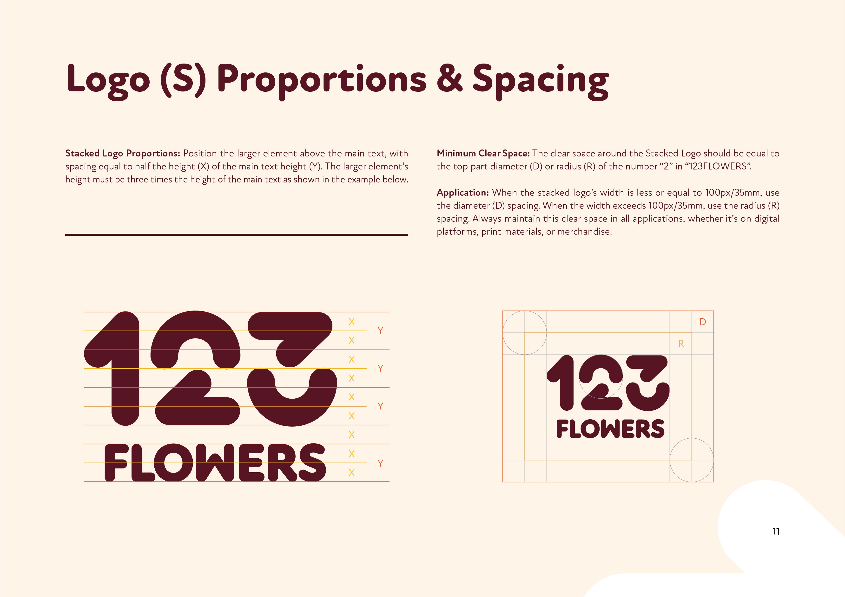
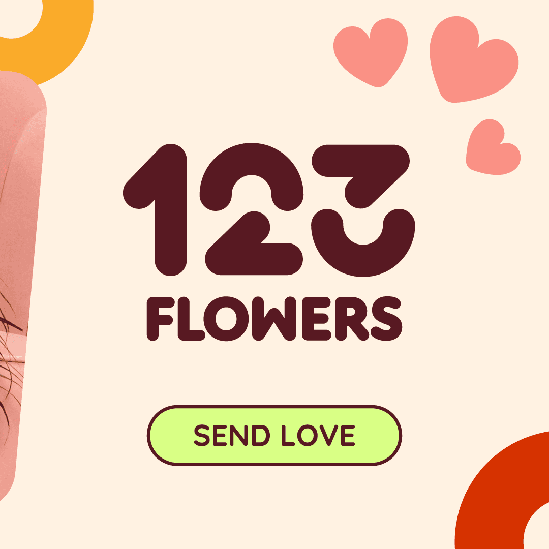
Starting with the logo, I designed custom numbers to create a more distinctive logotype, while keeping the overall direction aligned with its sibling brand 123Hampers by avoiding overly decorative floral elements.
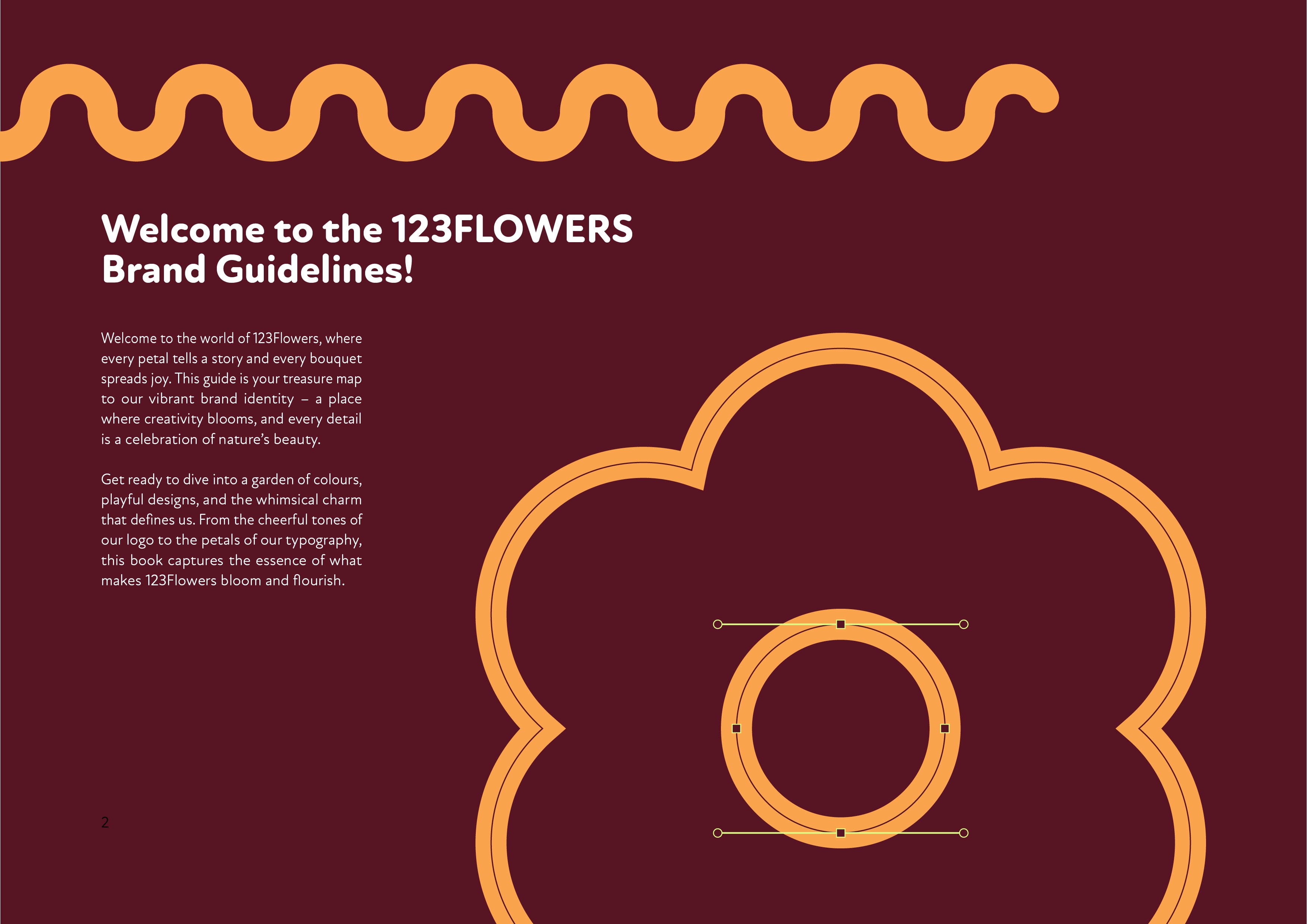
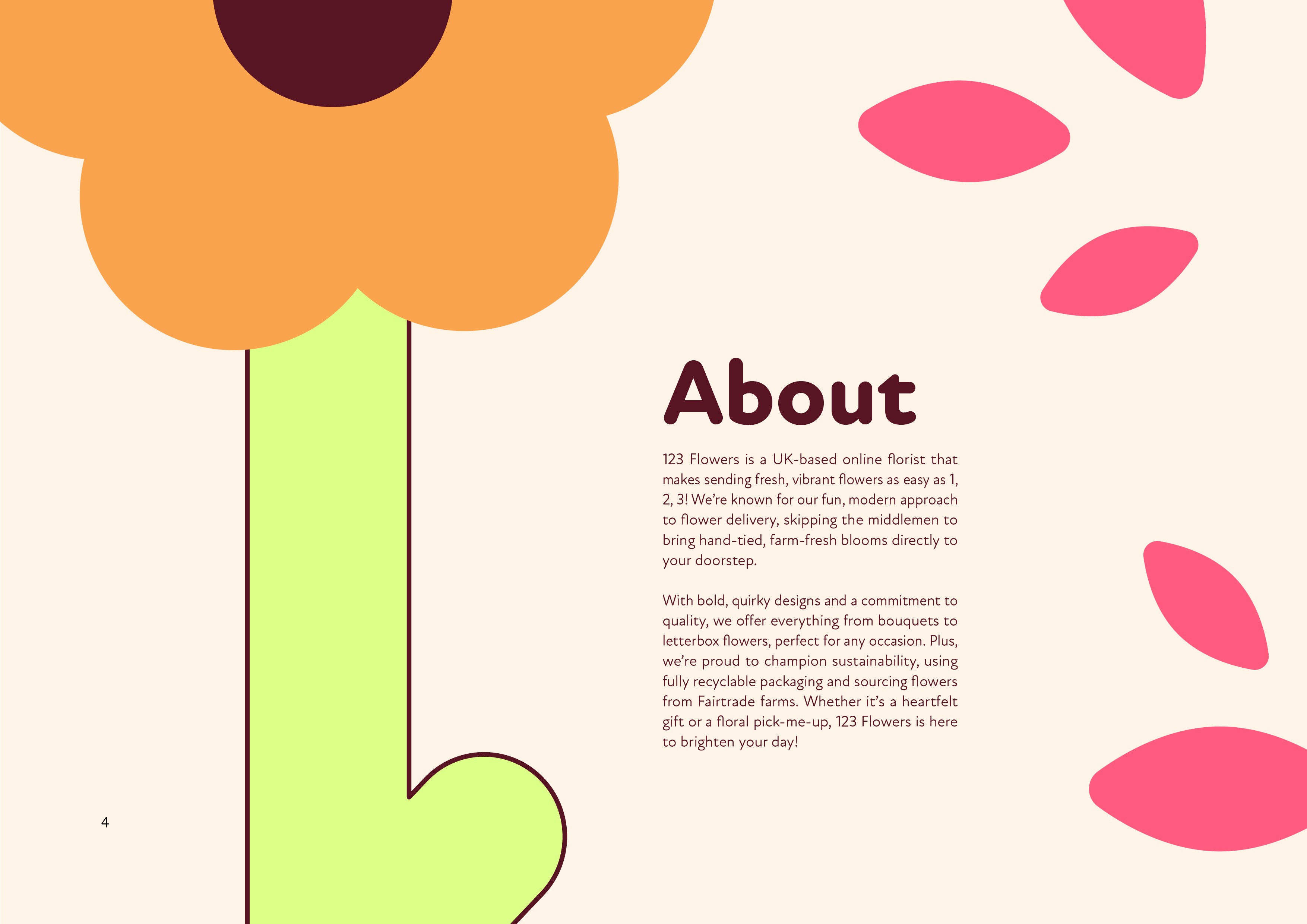
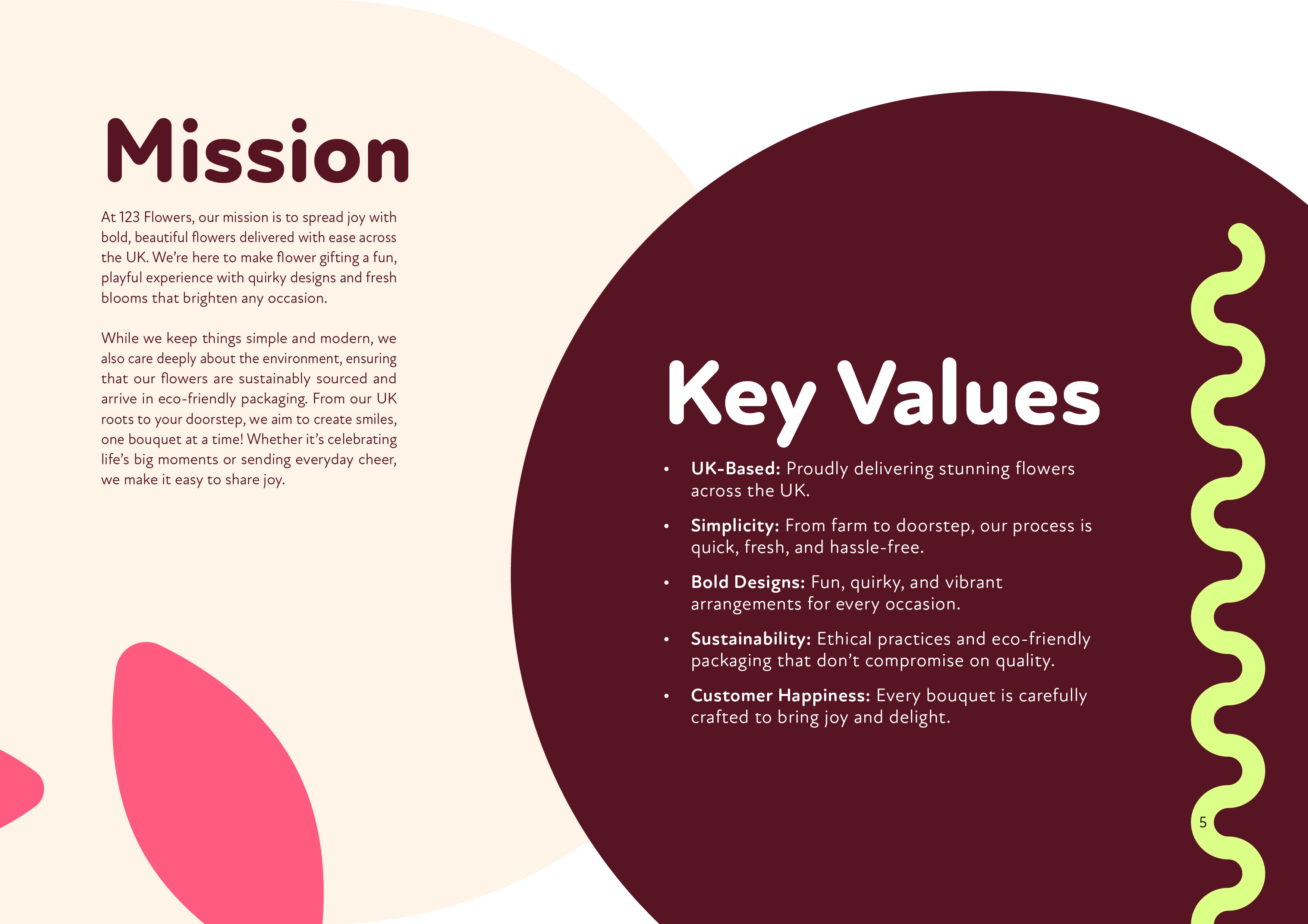
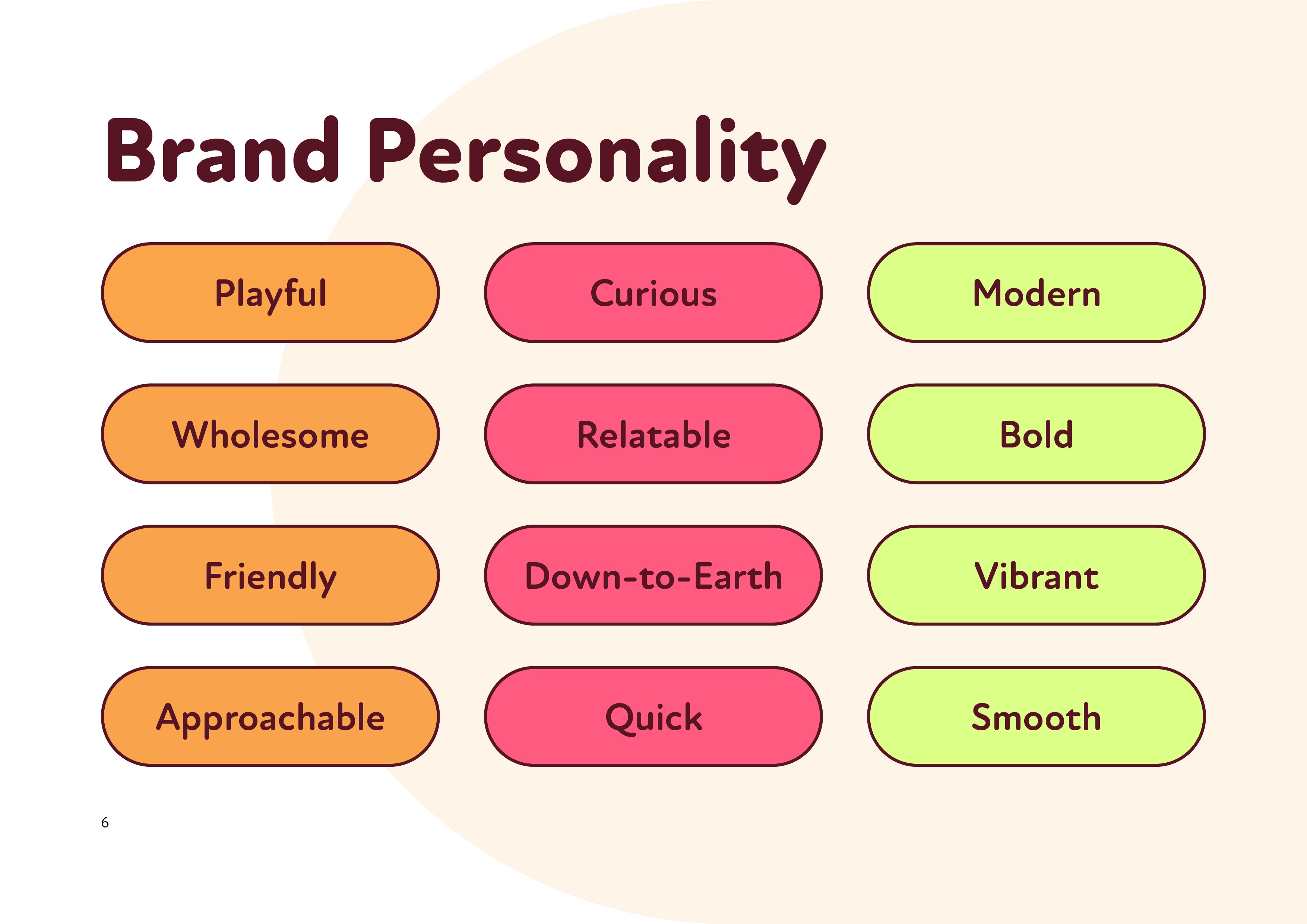
I then developed a colour palette that helped separate the brand from competitors, alongside playful graphic elements that brought some of that floral personality back into the identity.
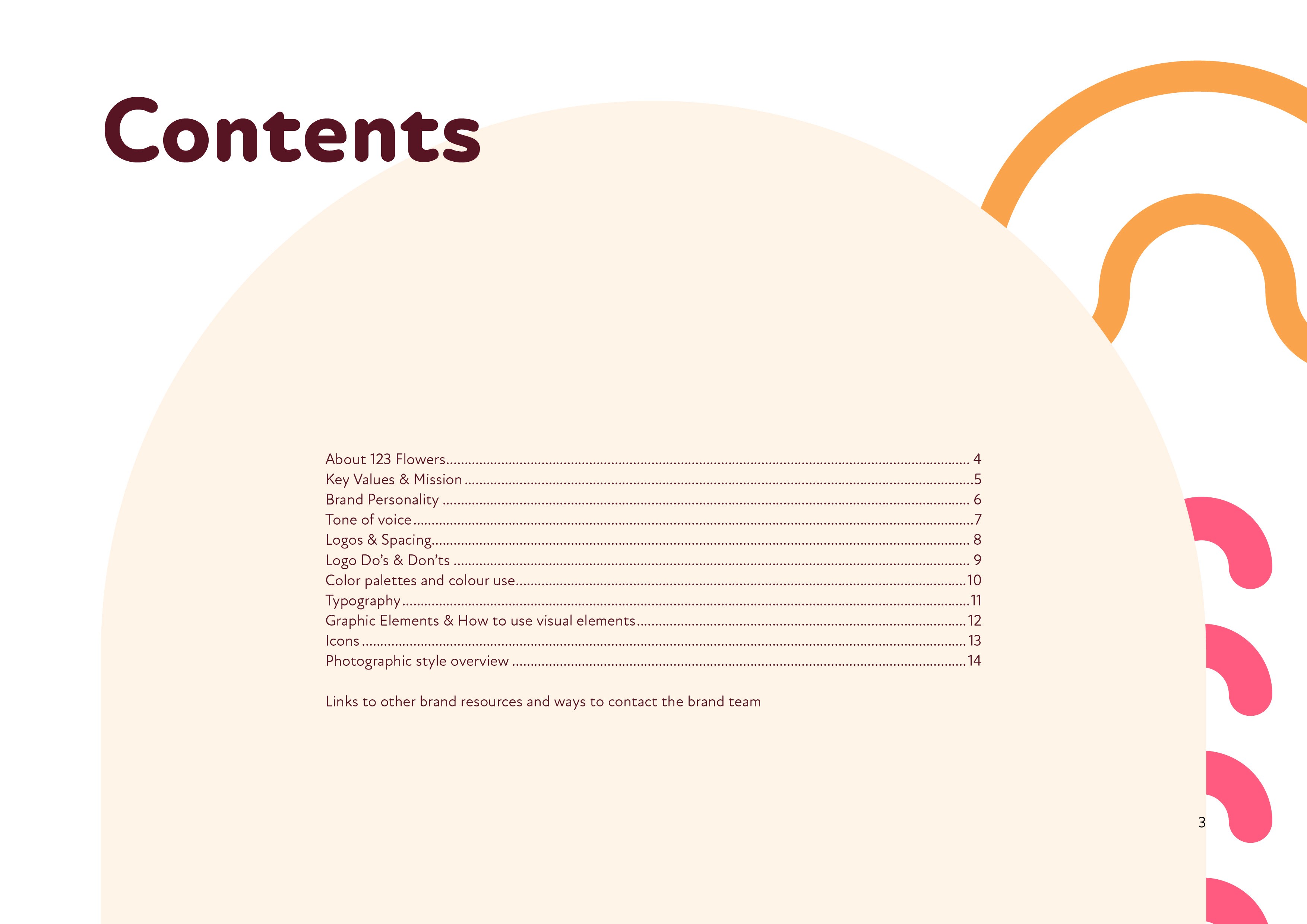
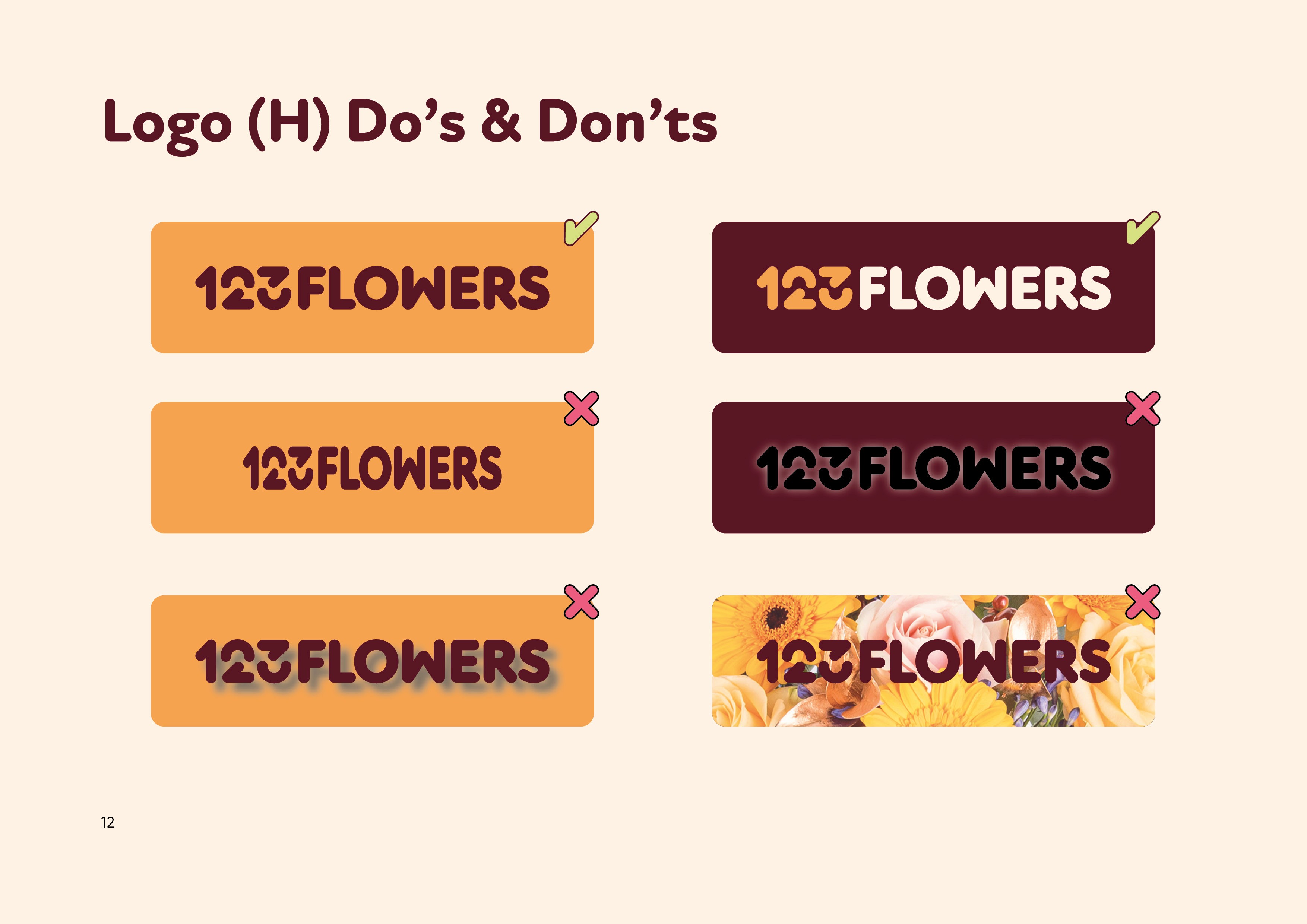
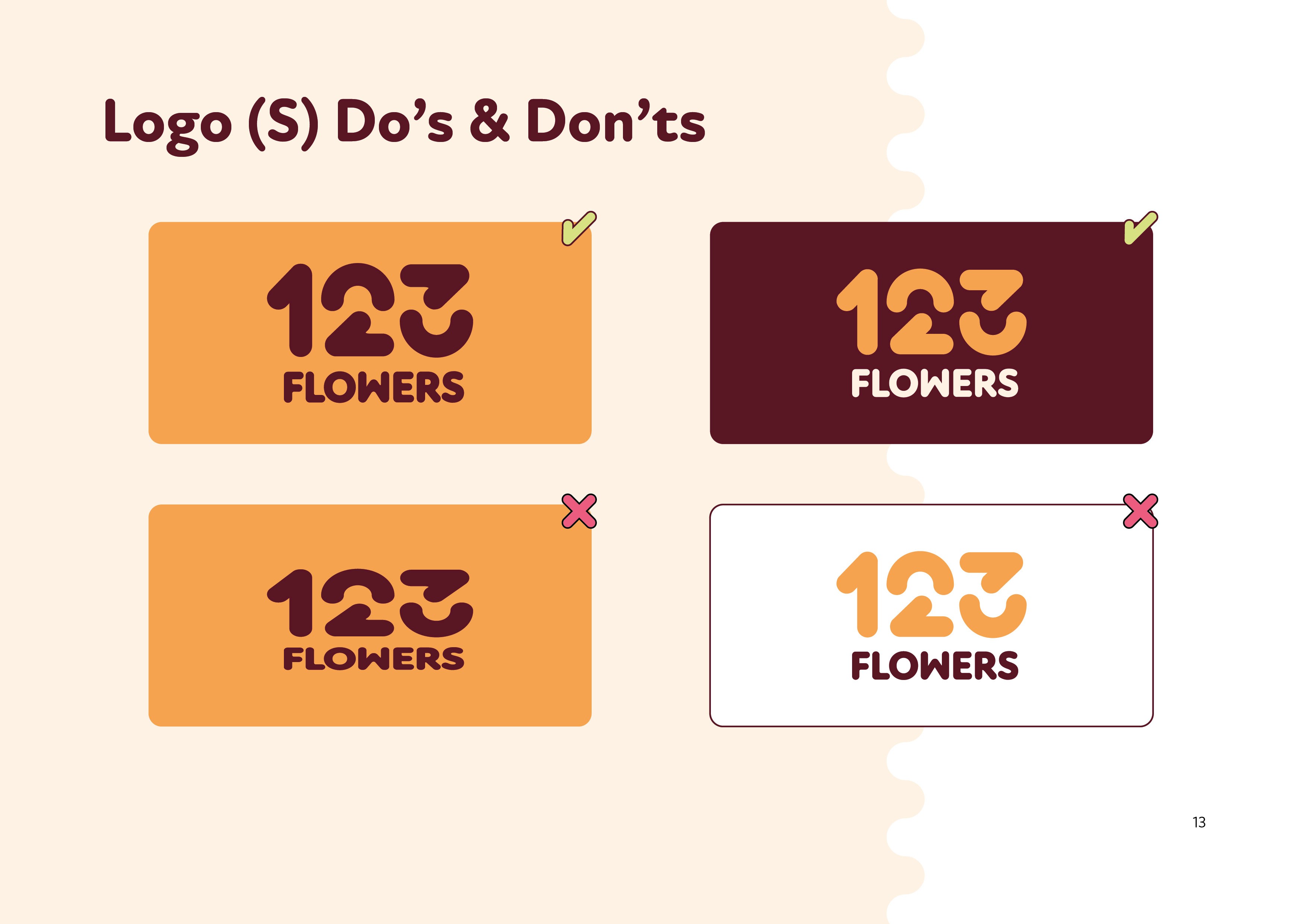
Finally, I documented the full system in detailed brand guidelines to ensure clarity and consistency.
Visual direction
TYPE
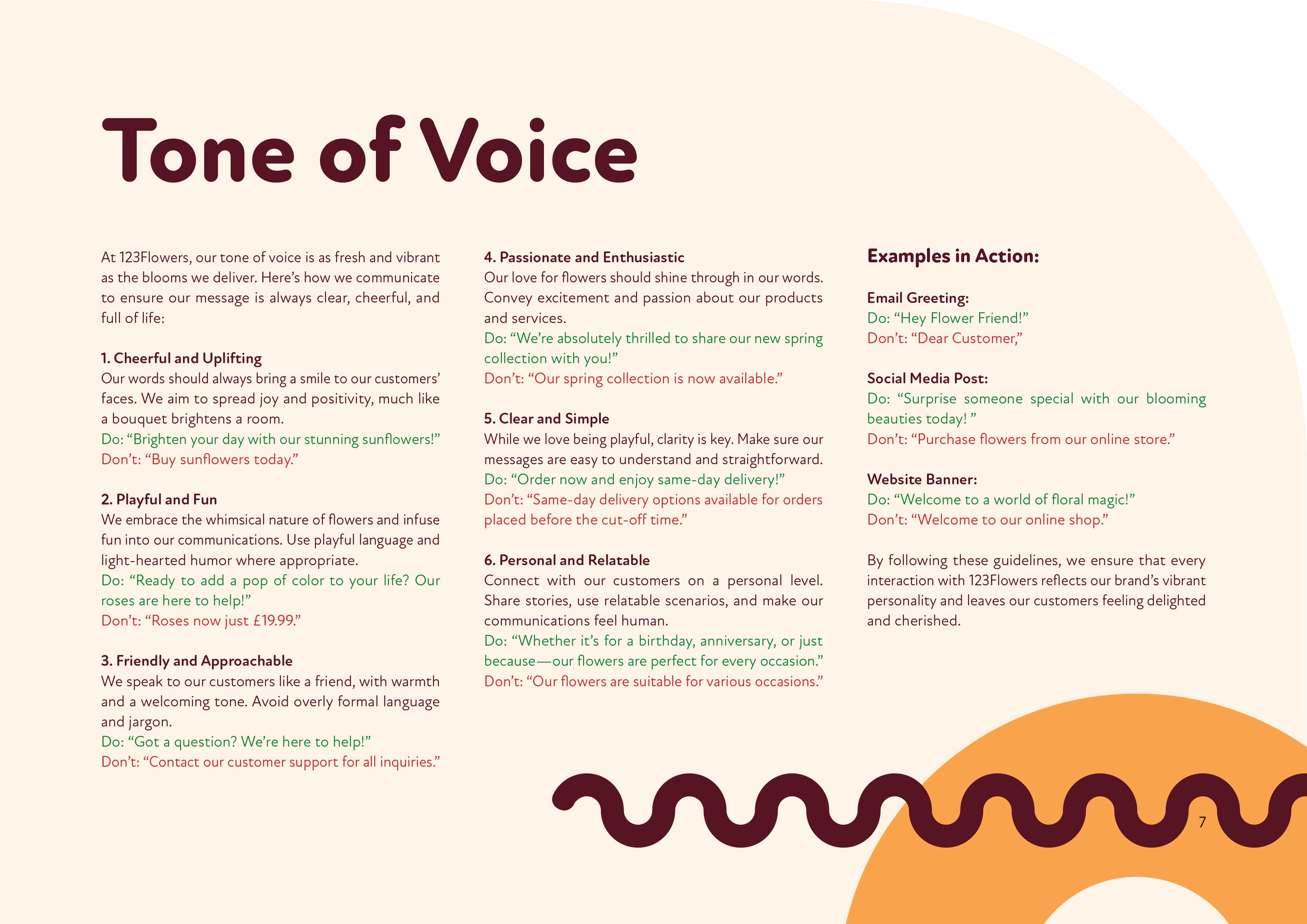
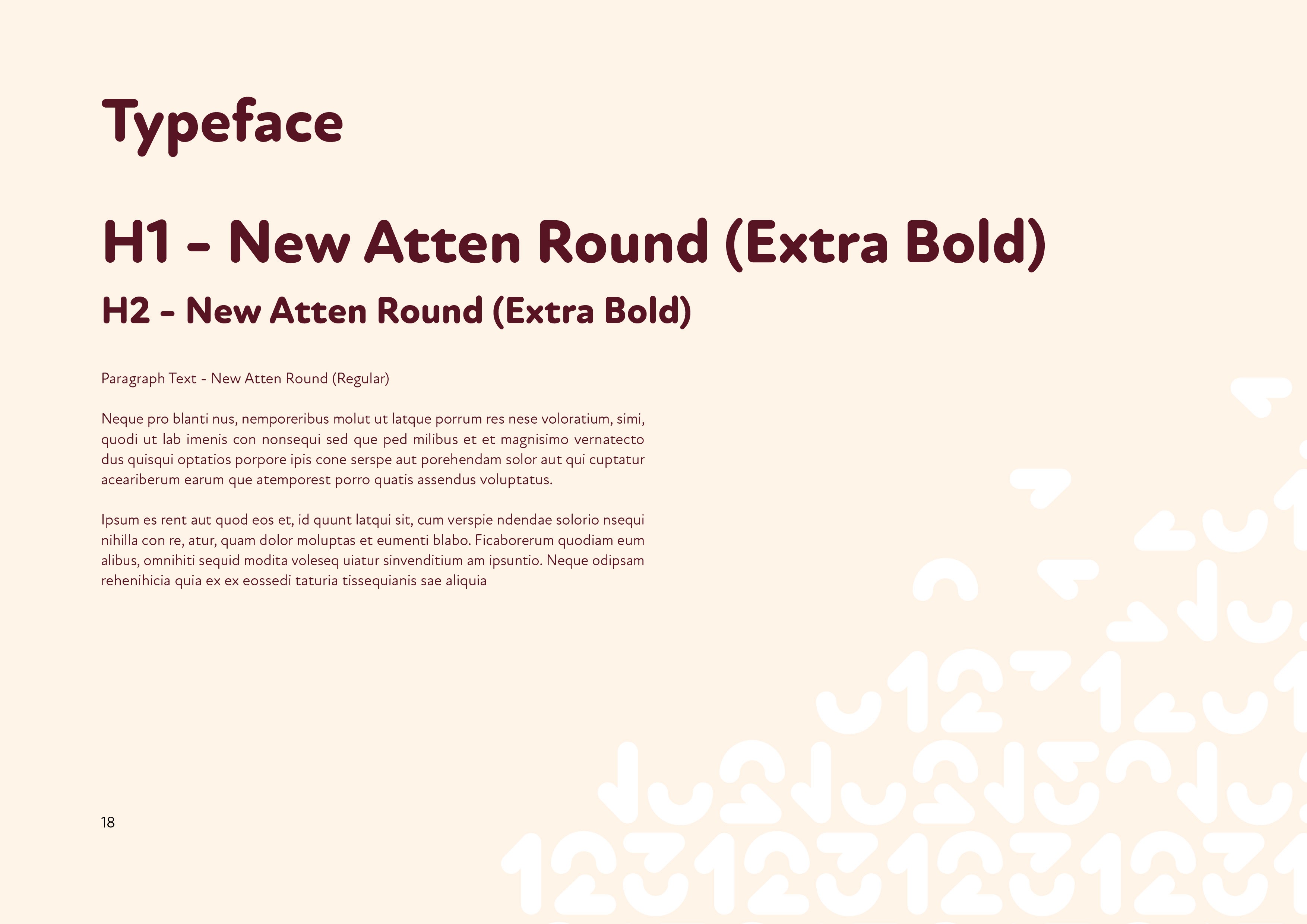
The visual direction balances playful and modern. I chose the typeface New Atten for its versatility — soft yet bold, with rounded edges for headings and sharper ones for body text.
COLOUR
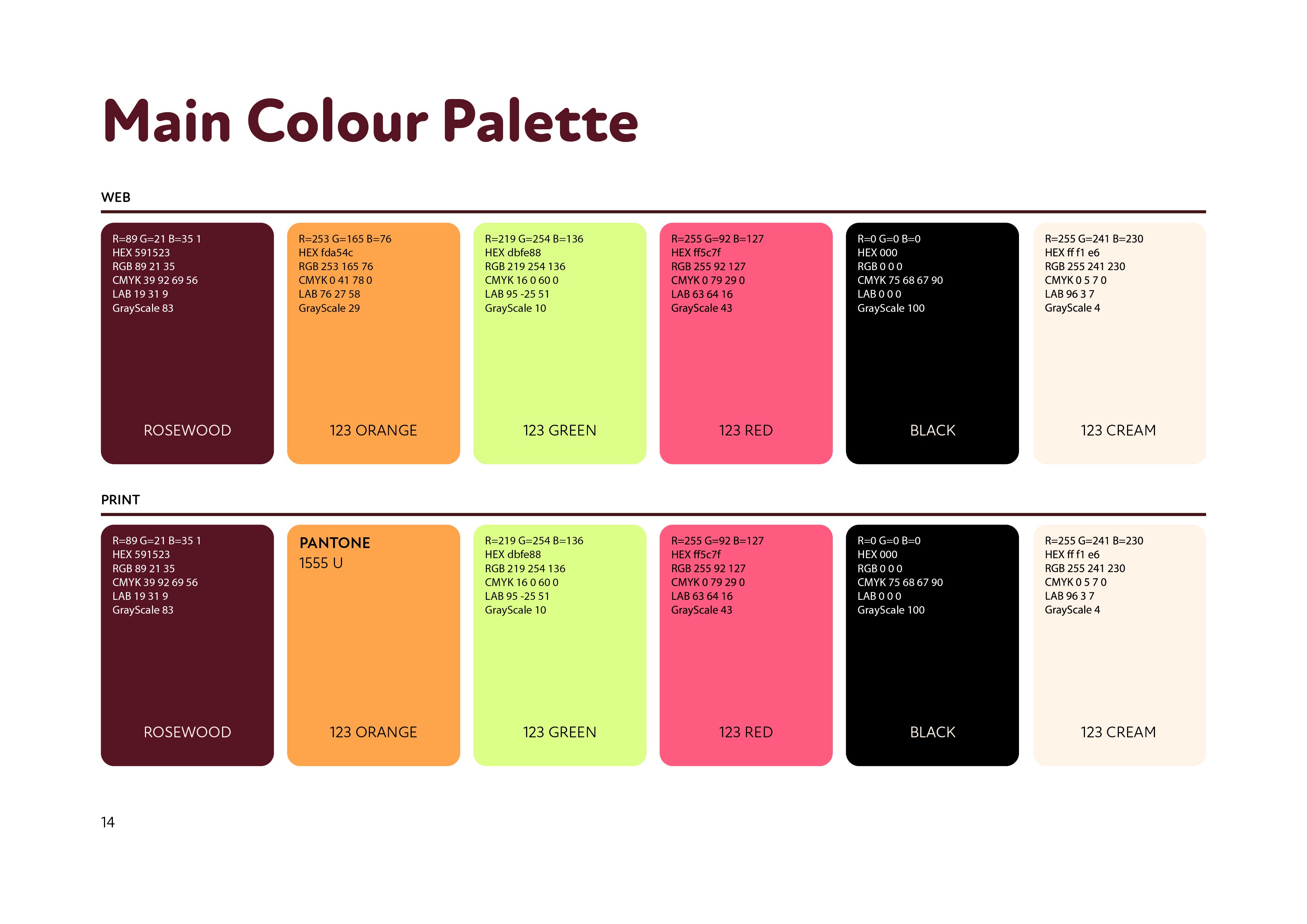
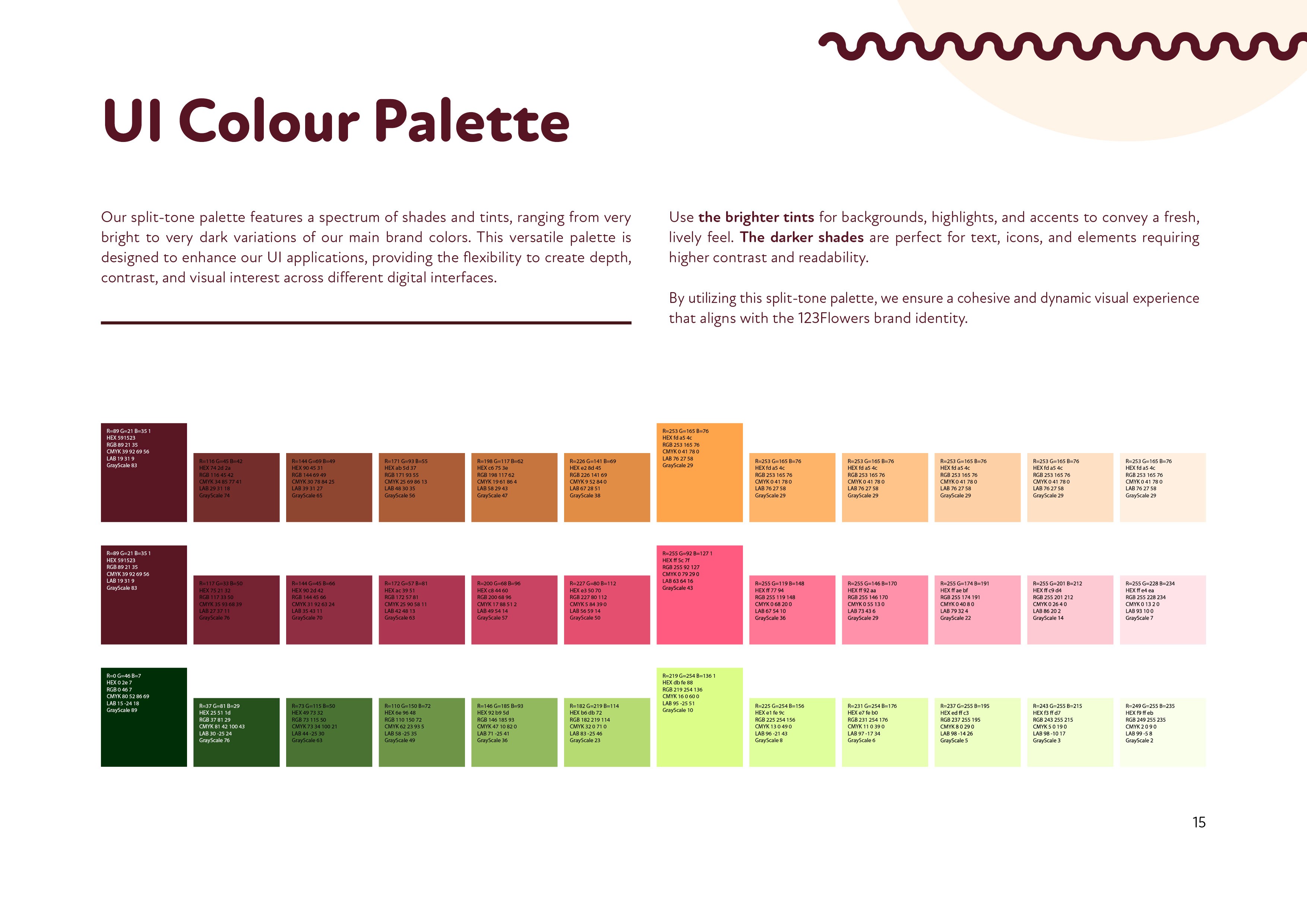
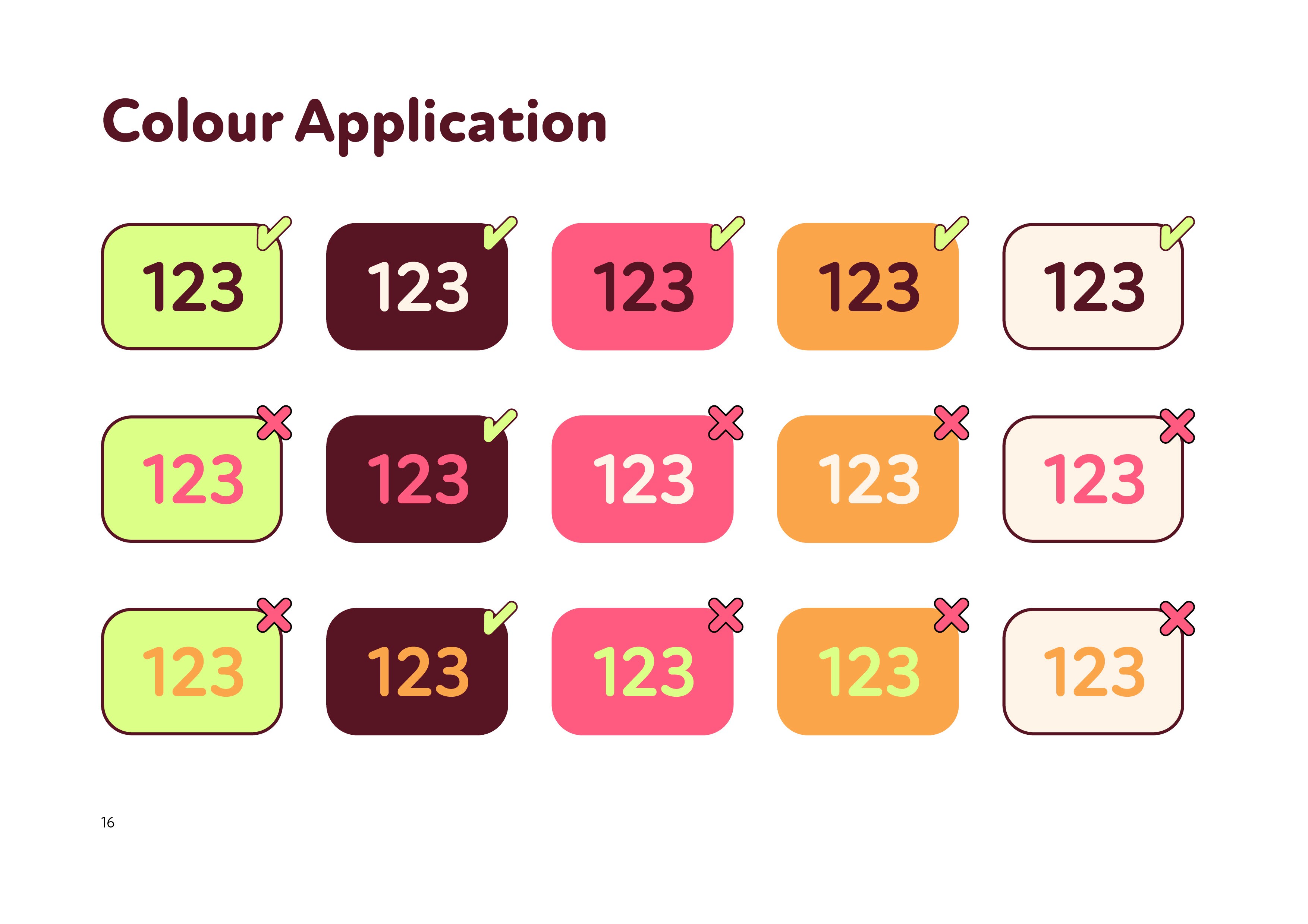
To keep the identity feeling both grounded and playful, I used vibrant colours alongside deeper rosewood and neutral cream tones to create contrast and improve legibility.
GRAPHICS
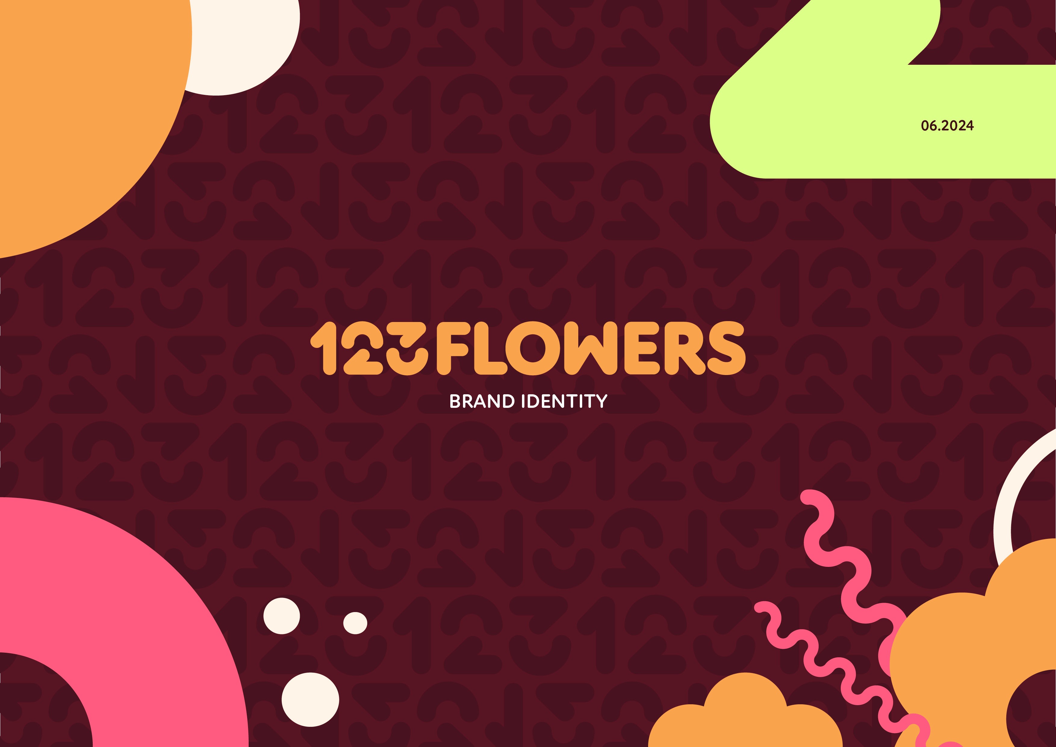
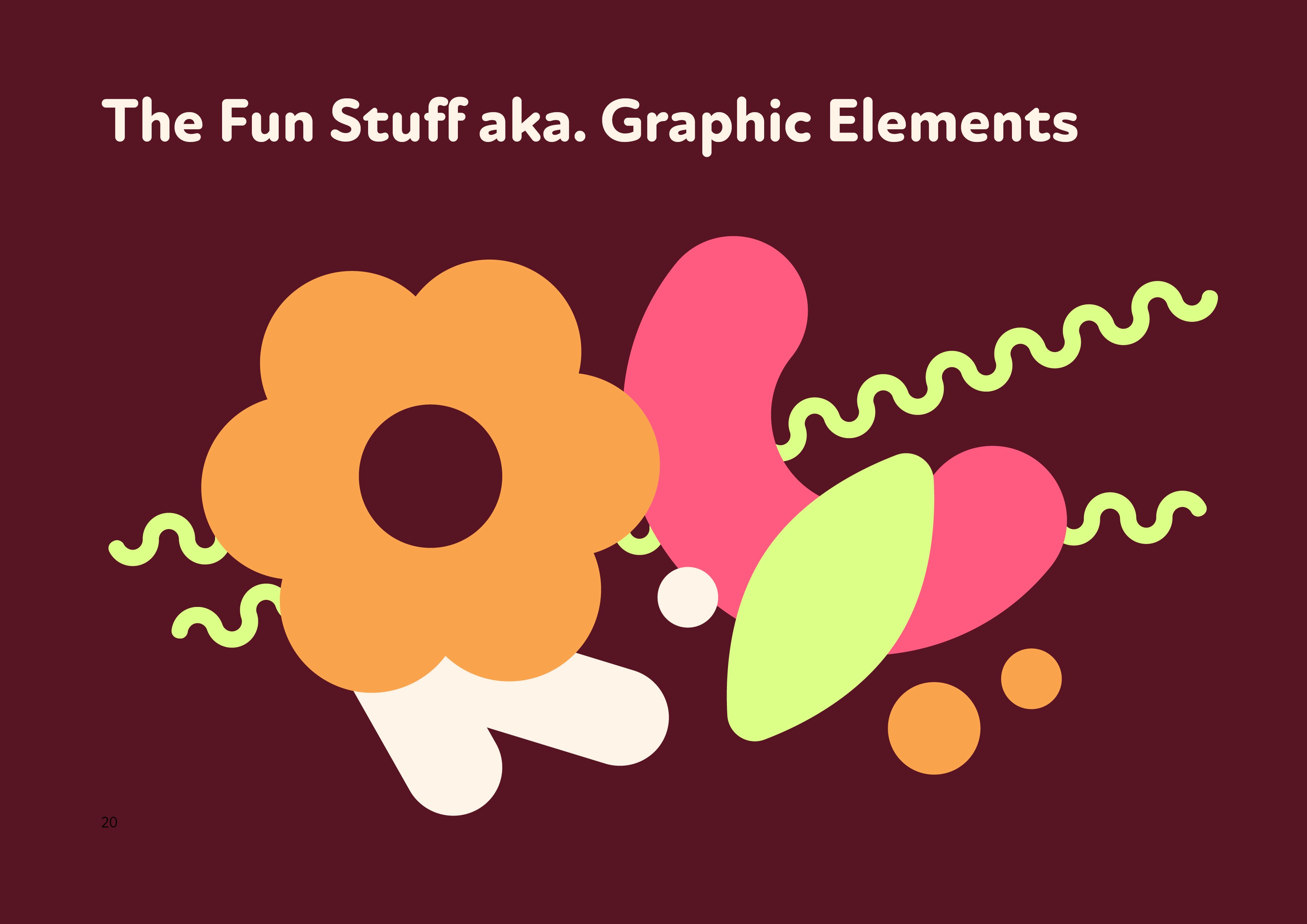
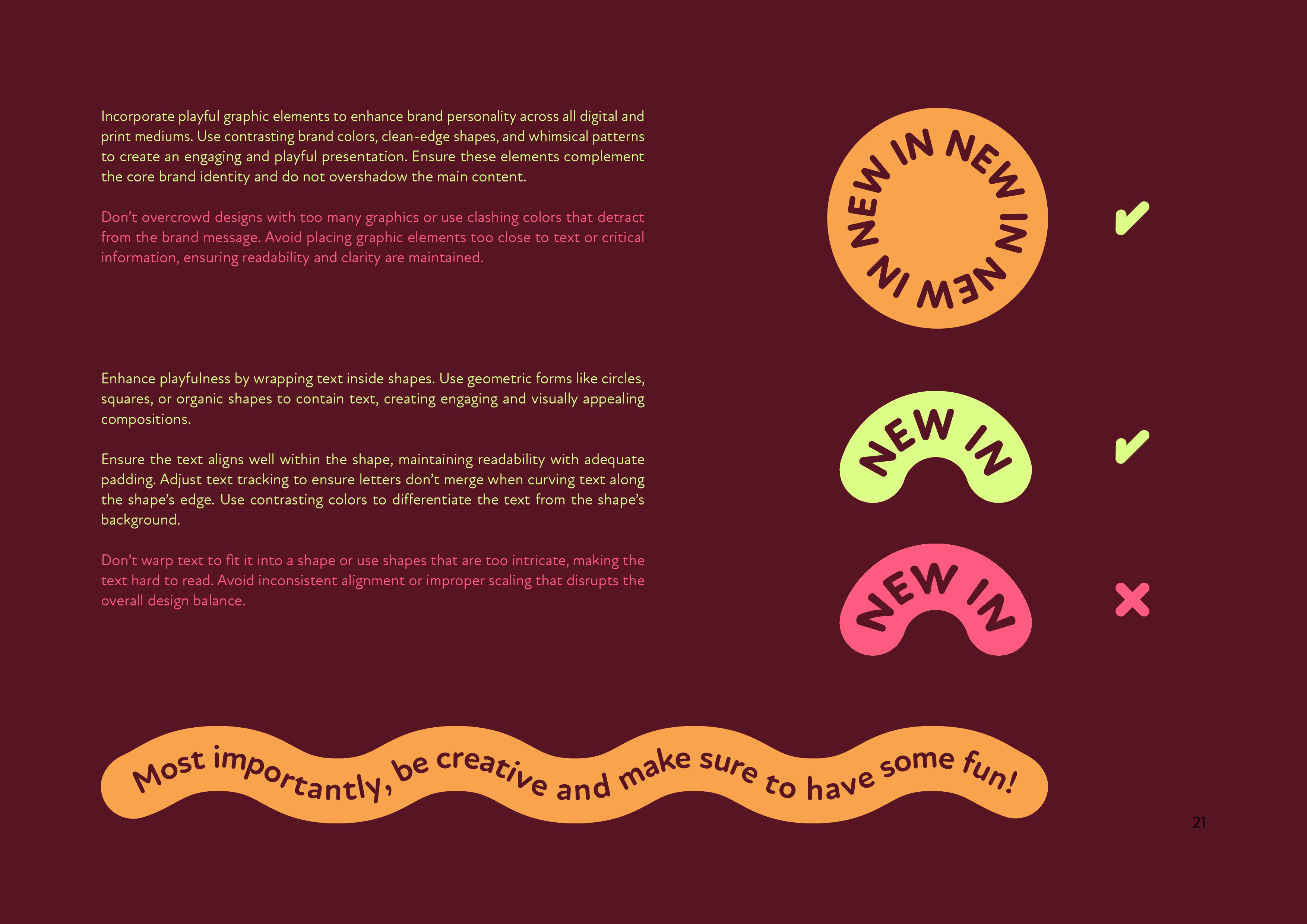
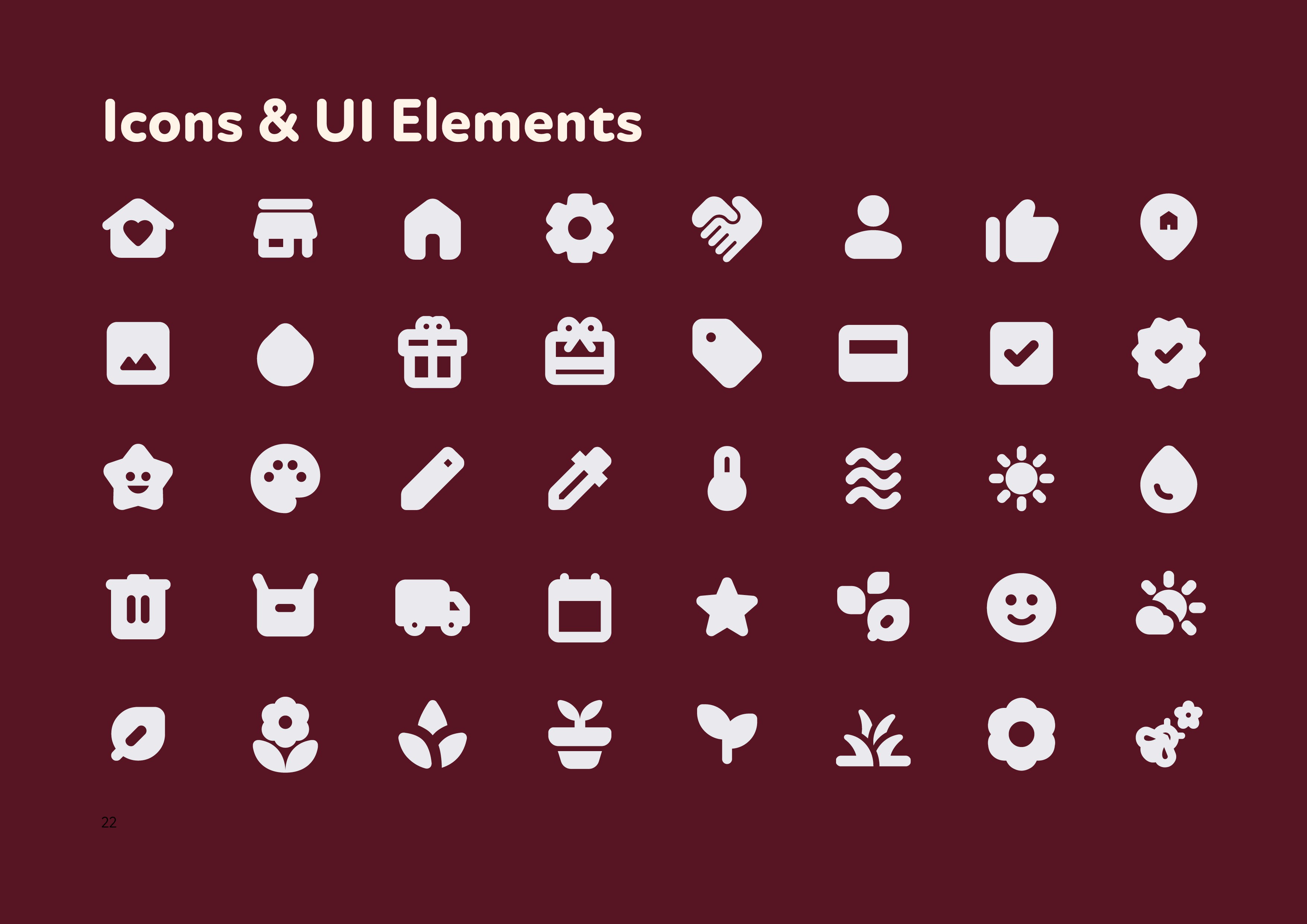
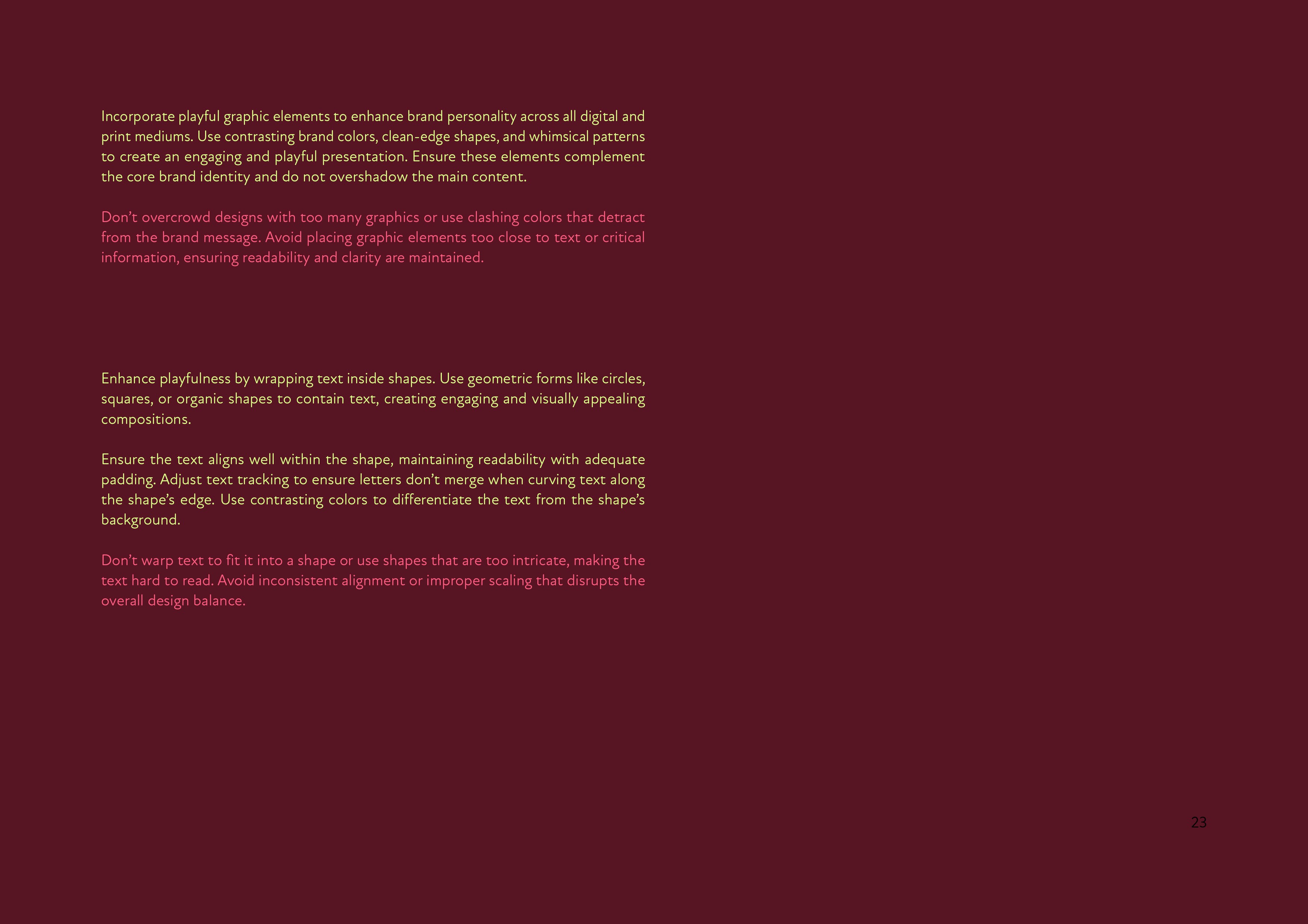
The custom 123 numbers also allowed me to create a unique brand pattern, while wiggly line elements helped guide the eye throughout layouts.
Every shape and colour was chosen with clarity and consistency in mind, creating a system that looks distinctive and is easy to use.
Application
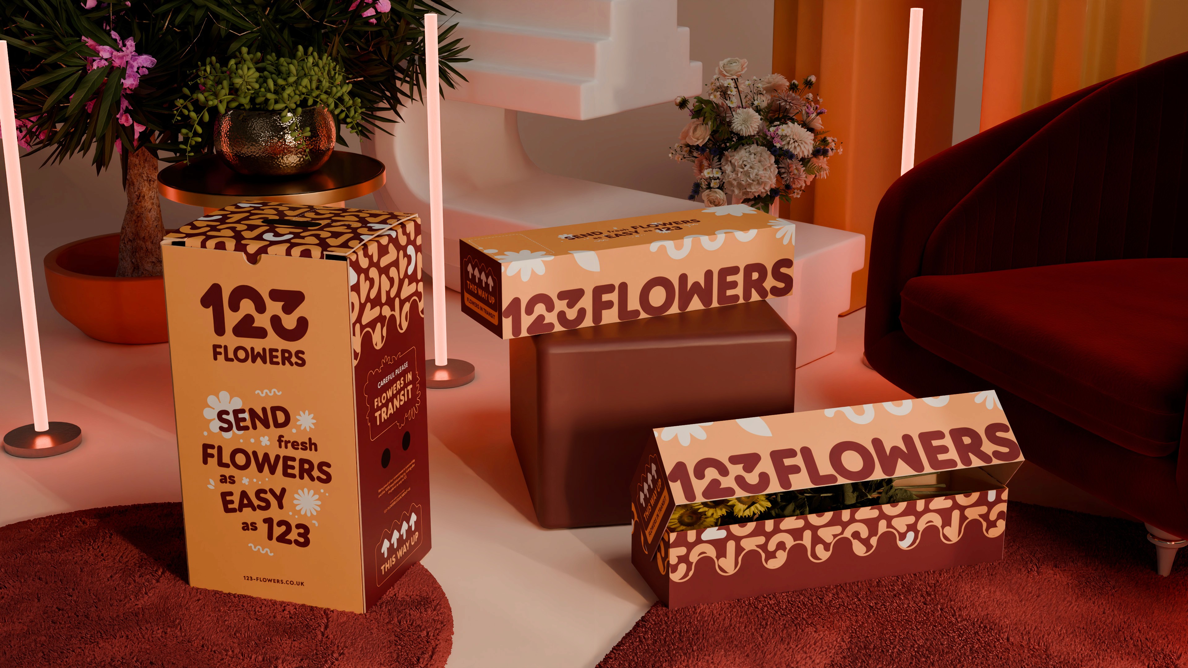
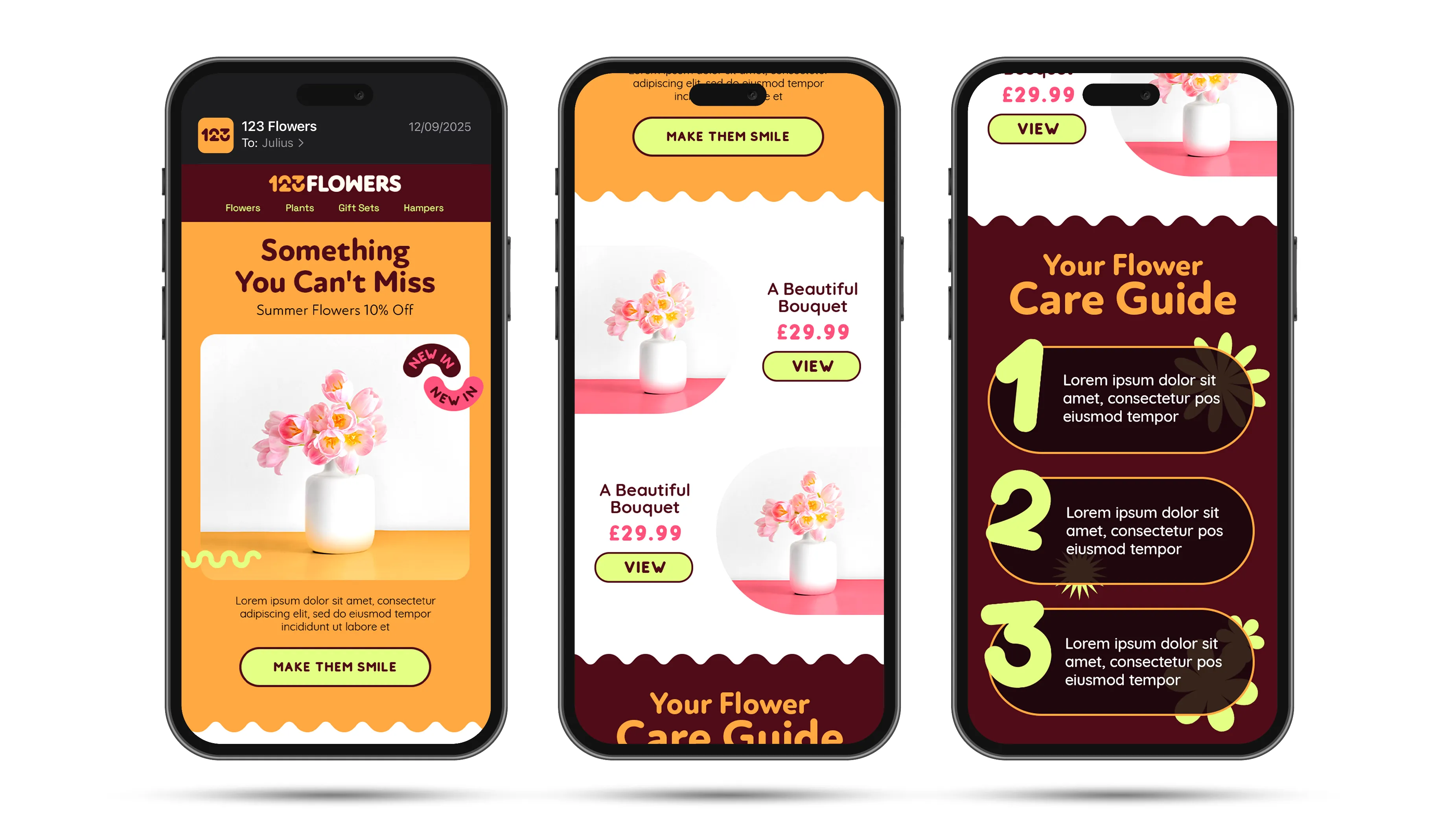
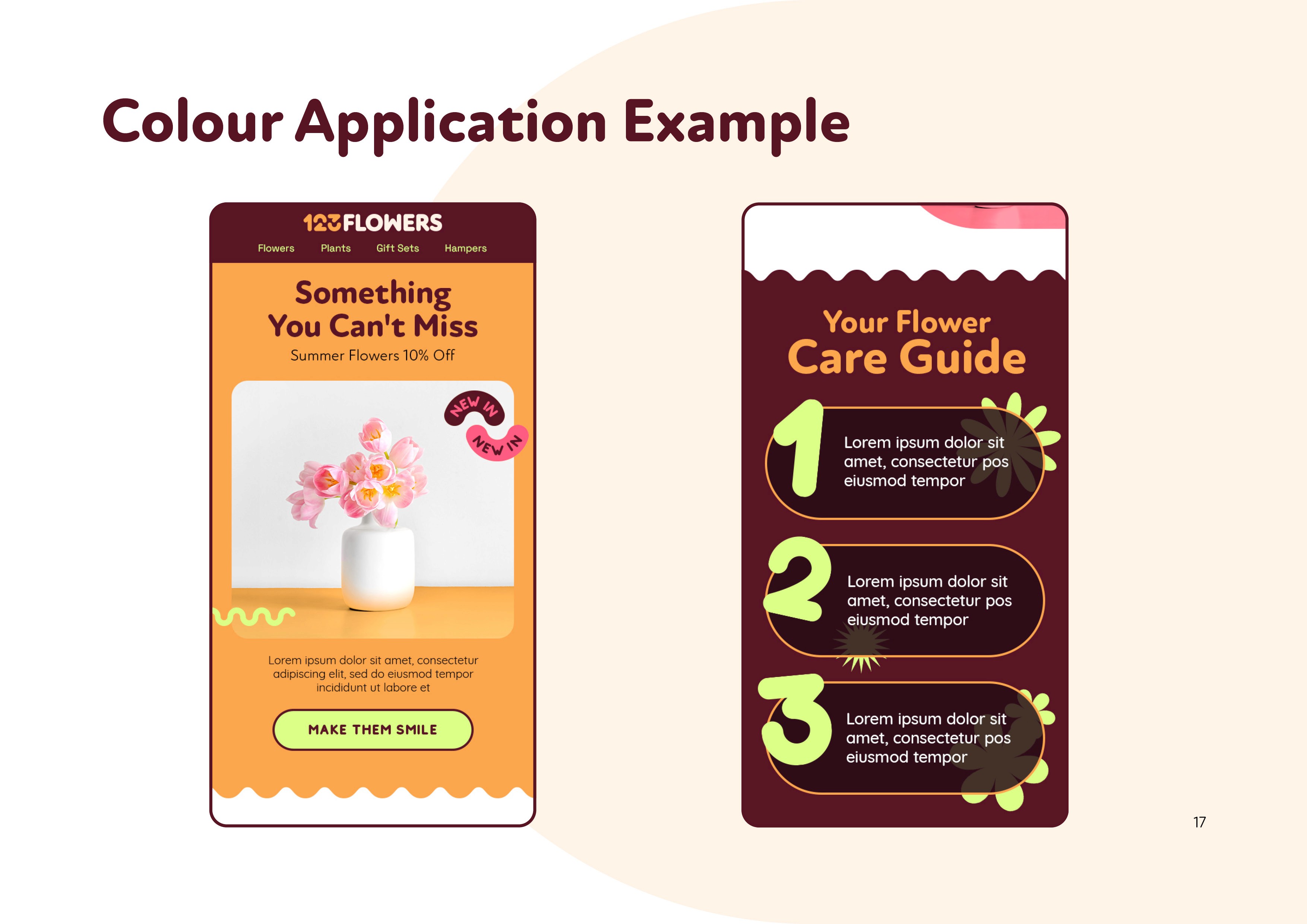
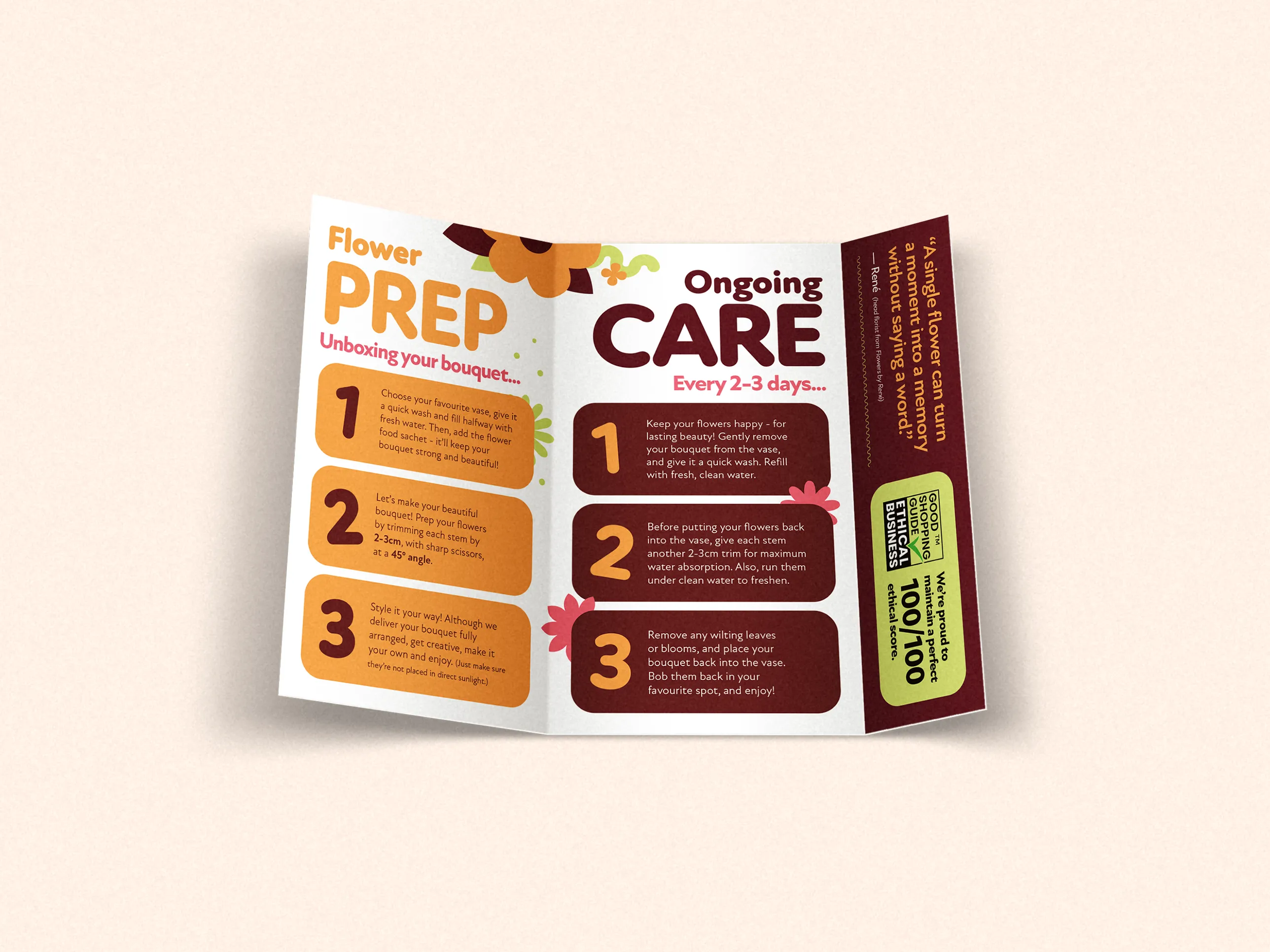
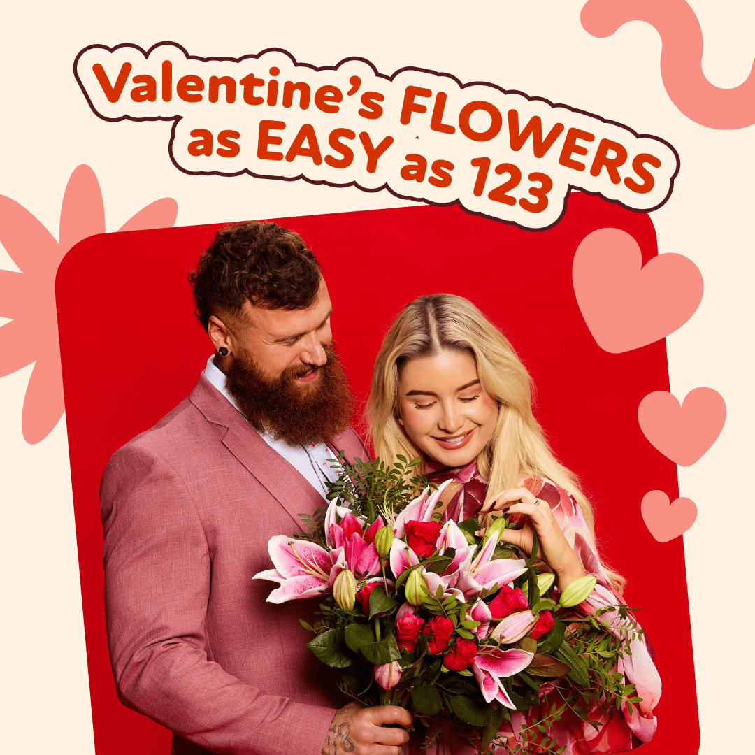
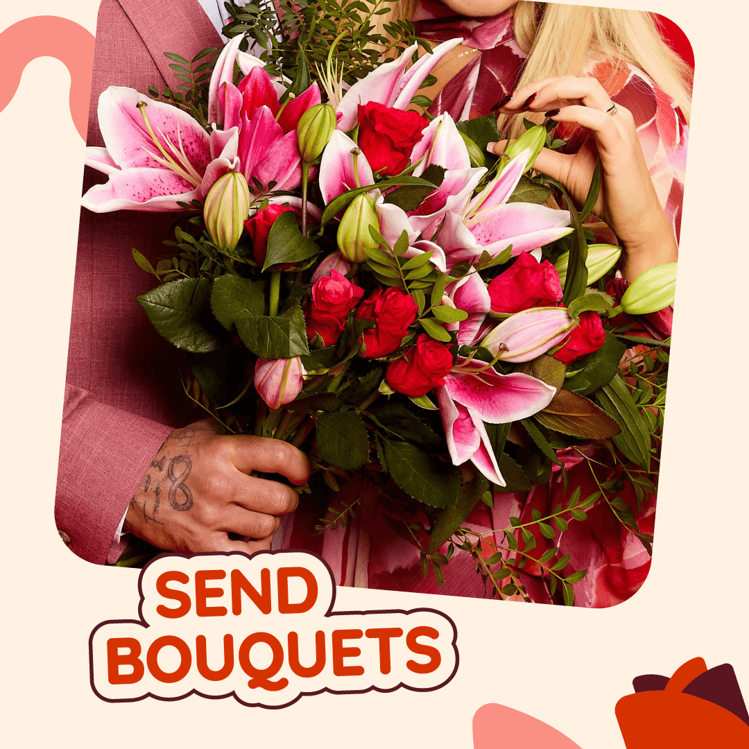
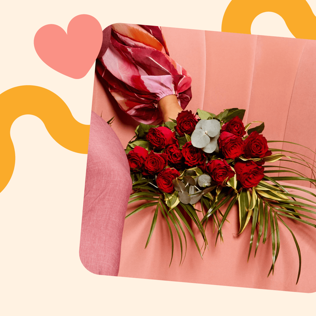
The brand system was applied across website assets, packaging, and major marketing campaigns, including Netflix and YouTube partnerships and national billboards.


Smooth Scroll
This will hide itself!
This will hide itself!
123Flowers
OVERVIEW
123Flowers is a UK flower delivery brand known for affordable bouquets and gifting. As Lead Graphic & Motion Designer, I refreshed the visual identity and developed a design system that could scale across everything from packaging and emails to large-scale marketing campaigns.
YEAR
2025
ROLE
LEAD GRAPHIC & MOTION DESIGNER
RESPONSIBILITIES
BRAND VISUAL IDENTITY
DESIGN SYSTEM
DESIGN APPLICATION
About the project
GOAL
This project was all about refreshing the brand and bringing it up to date.
SOLUTION
Starting with the logo, I designed custom numbers to create a more distinctive logotype, while keeping the overall direction aligned with its sibling brand 123Hampers by avoiding overly decorative floral elements.
I then developed a colour palette that helped separate the brand from competitors, alongside playful graphic elements that brought some of that floral personality back into the identity.
Finally, I documented the full system in detailed brand guidelines to ensure clarity and consistency.
Visual direction
TYPE
The visual direction balances playful and modern. I chose the typeface New Atten for its versatility — soft yet bold, with rounded edges for headings and sharper ones for body text.
COLOUR
To keep the identity feeling both grounded and playful, I used vibrant colours alongside deeper rosewood and neutral cream tones to create contrast and improve legibility.
GRAPHICS
The custom 123 numbers also allowed me to create a unique brand pattern, while wiggly line elements helped guide the eye throughout layouts.
Every shape and colour was chosen with clarity and consistency in mind, creating a system that looks distinctive and is easy to use.
Application
The brand system was applied across website assets, packaging, and major marketing campaigns, including Netflix and YouTube partnerships and national billboards.
Smooth Scroll
This will hide itself!
This will hide itself!
123Flowers
OVERVIEW
123Flowers is a UK flower delivery brand known for affordable bouquets and gifting. As Lead Graphic & Motion Designer, I refreshed the visual identity and developed a design system that could scale across everything from packaging and emails to large-scale marketing campaigns.
YEAR
2025
ROLE
LEAD GRAPHIC & MOTION DESIGNER
RESPONSIBILITIES
BRAND VISUAL IDENTITY
DESIGN SYSTEM
DESIGN APPLICATION
About the project
GOAL
This project was all about refreshing the brand and bringing it up to date.
SOLUTION
Starting with the logo, I designed custom numbers to create a more distinctive logotype, while keeping the overall direction aligned with its sibling brand 123Hampers by avoiding overly decorative floral elements.
I then developed a colour palette that helped separate the brand from competitors, alongside playful graphic elements that brought some of that floral personality back into the identity.
Finally, I documented the full system in detailed brand guidelines to ensure clarity and consistency.
Visual direction
TYPE
The visual direction balances playful and modern. I chose the typeface New Atten for its versatility — soft yet bold, with rounded edges for headings and sharper ones for body text.
COLOUR
To keep the identity feeling both grounded and playful, I used vibrant colours alongside deeper rosewood and neutral cream tones to create contrast and improve legibility.
GRAPHICS
The custom 123 numbers also allowed me to create a unique brand pattern, while wiggly line elements helped guide the eye throughout layouts.
Every shape and colour was chosen with clarity and consistency in mind, creating a system that looks distinctive and is easy to use.
Application
The brand system was applied across website assets, packaging, and major marketing campaigns, including Netflix and YouTube partnerships and national billboards.
Smooth Scroll
This will hide itself!
This will hide itself!