NXT LVL is a retro arcade bar offering games, street style food and drinks. While the previous branding mainly focused on the arcade visuals, it left out the food, drinks and distinct personality. My role was to create a new visual identity that better reflected the bar's livelyness and vibrant menu offerings.
YEAR
2024
ROLE
GRAPHIC DESIGNER
RESPONSIBILITIES
VISAUL IDENTITY
PRINT DESIGN
ILLUSTRATION
About the project
GOAL
Create a more distinctive identity that reflects the atmosphere of the venue while moving away from a generic retro arcade aesthetic.
The new style also needed to remain flexible enough for frequent menu updates, seasonal promotions and marketing campaigns.
Visual direction
The new direction came from the bar’s partnership with TUMBS, an illustrator who had created a mural inside the venue.
GRAPHICS
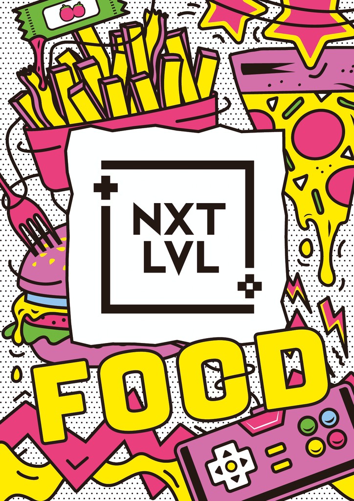
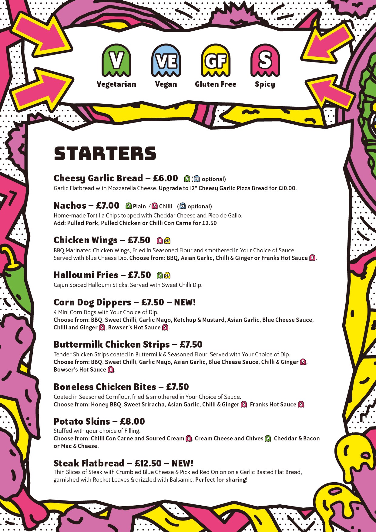
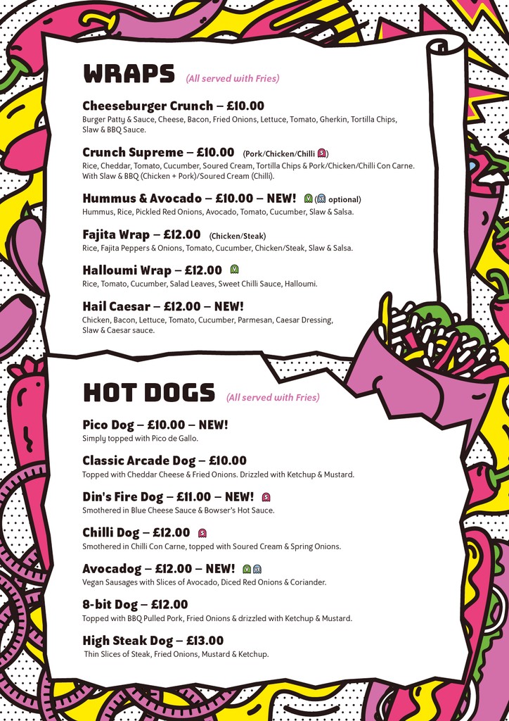
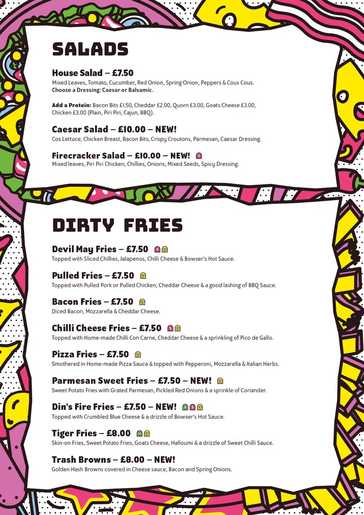
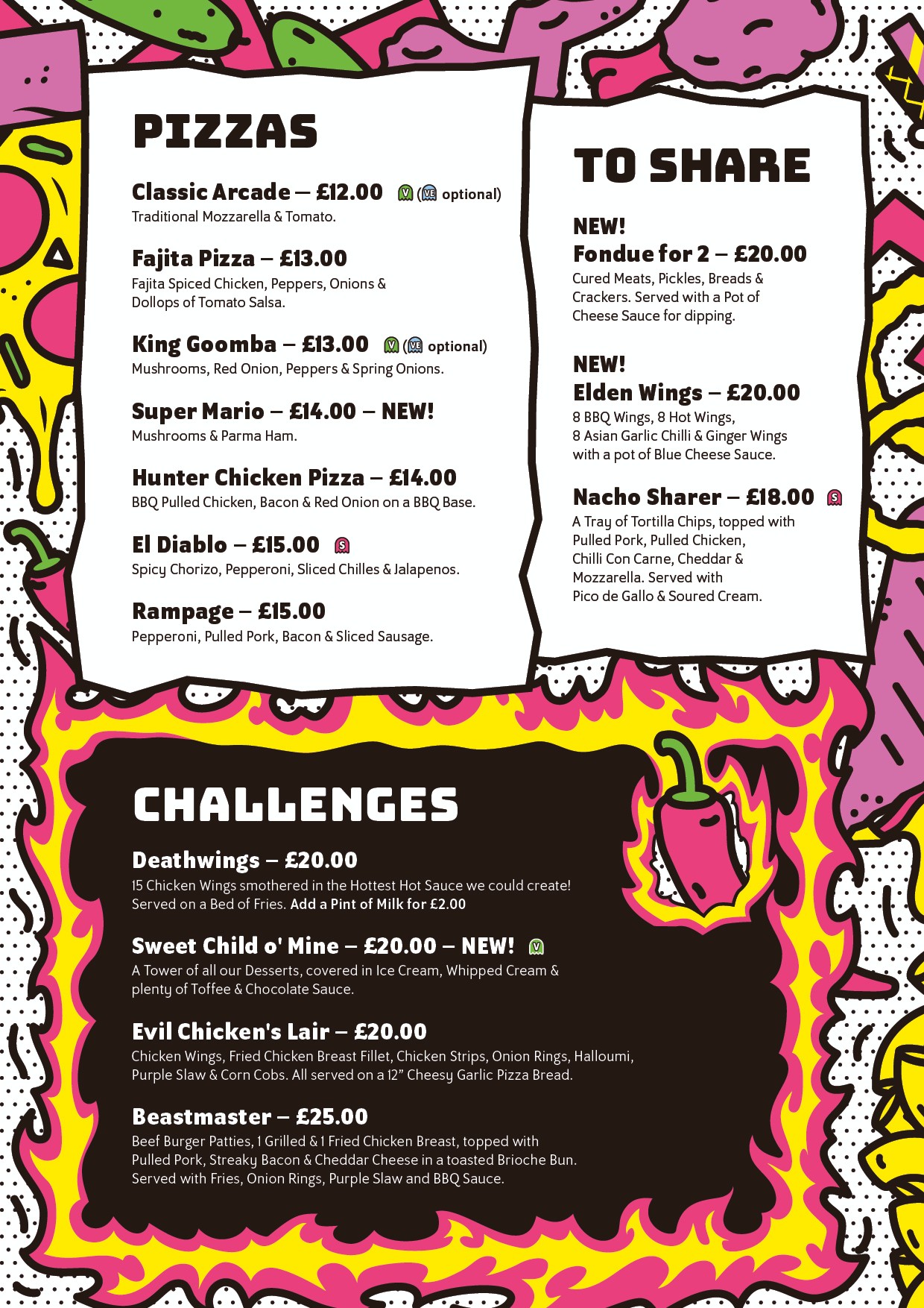
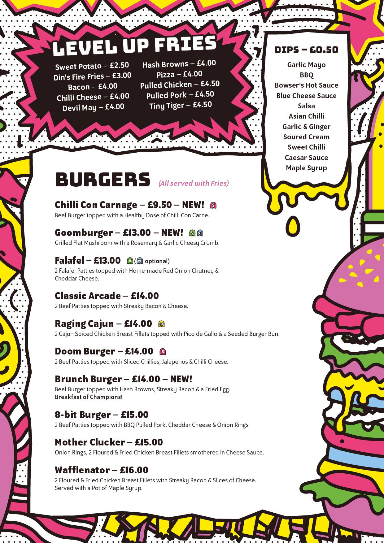
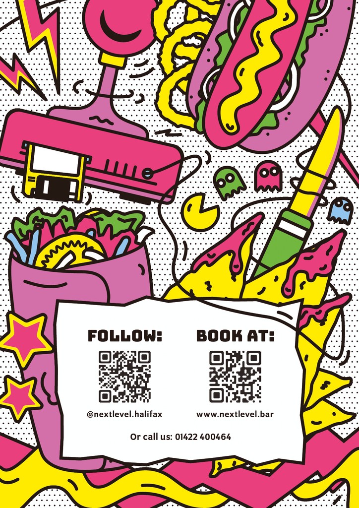
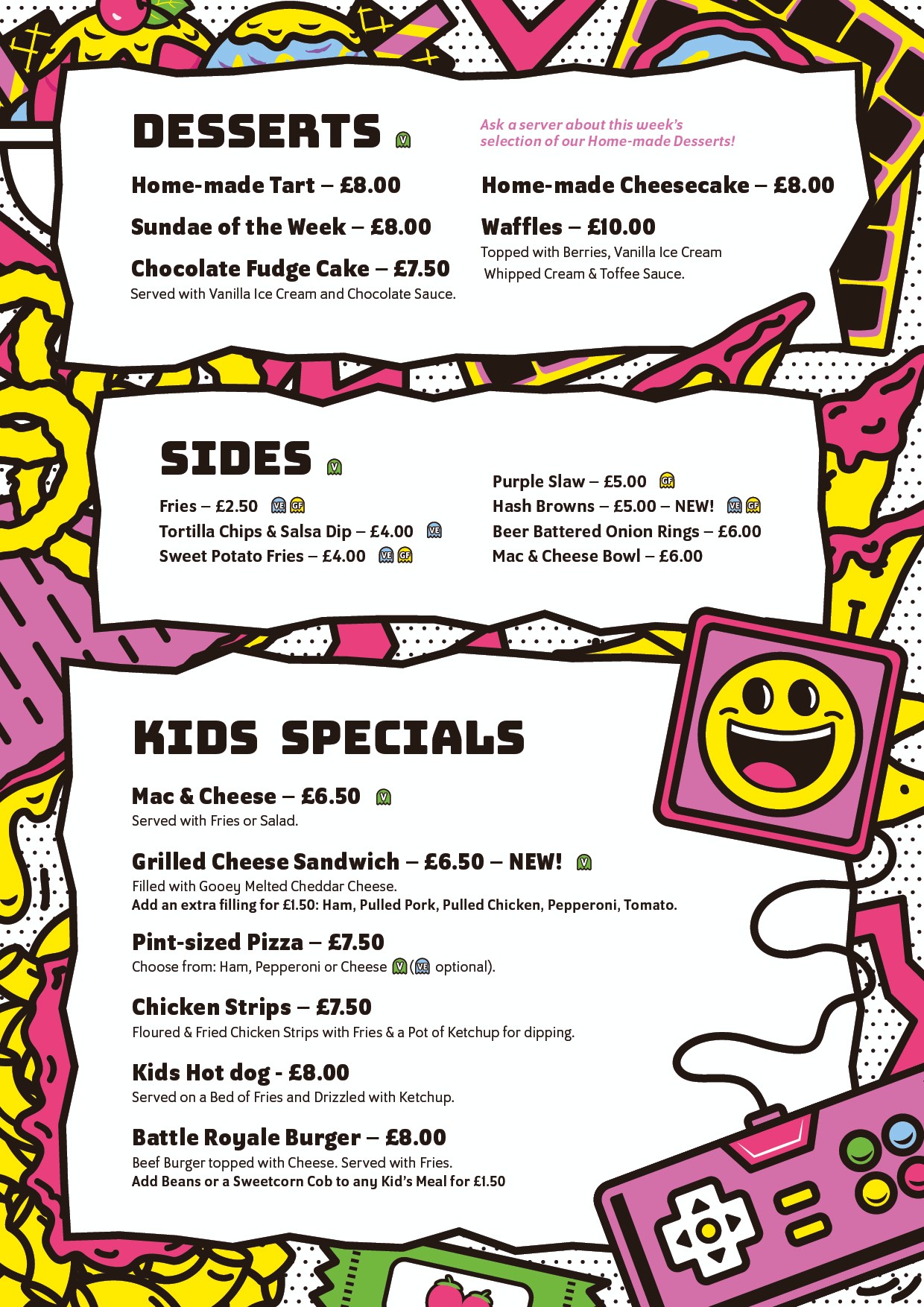
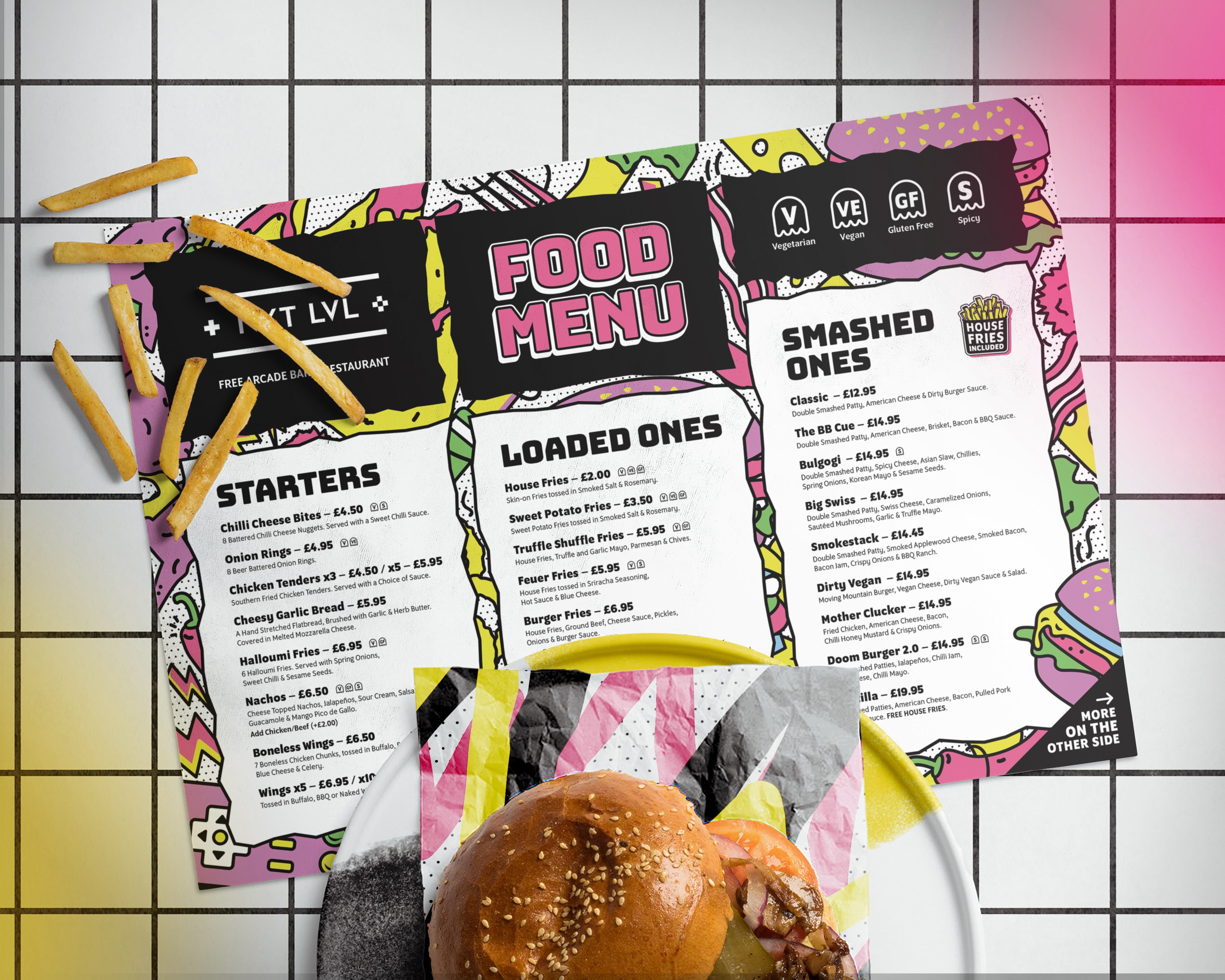
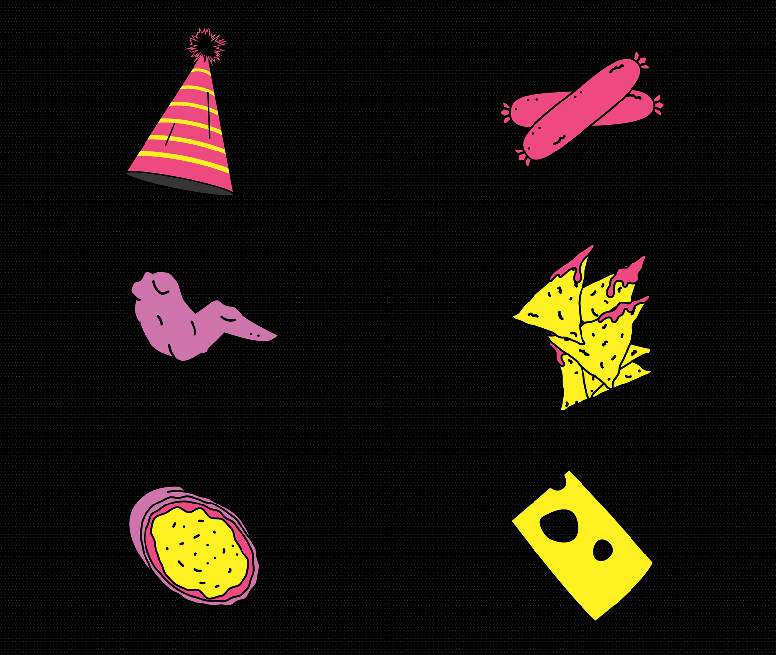
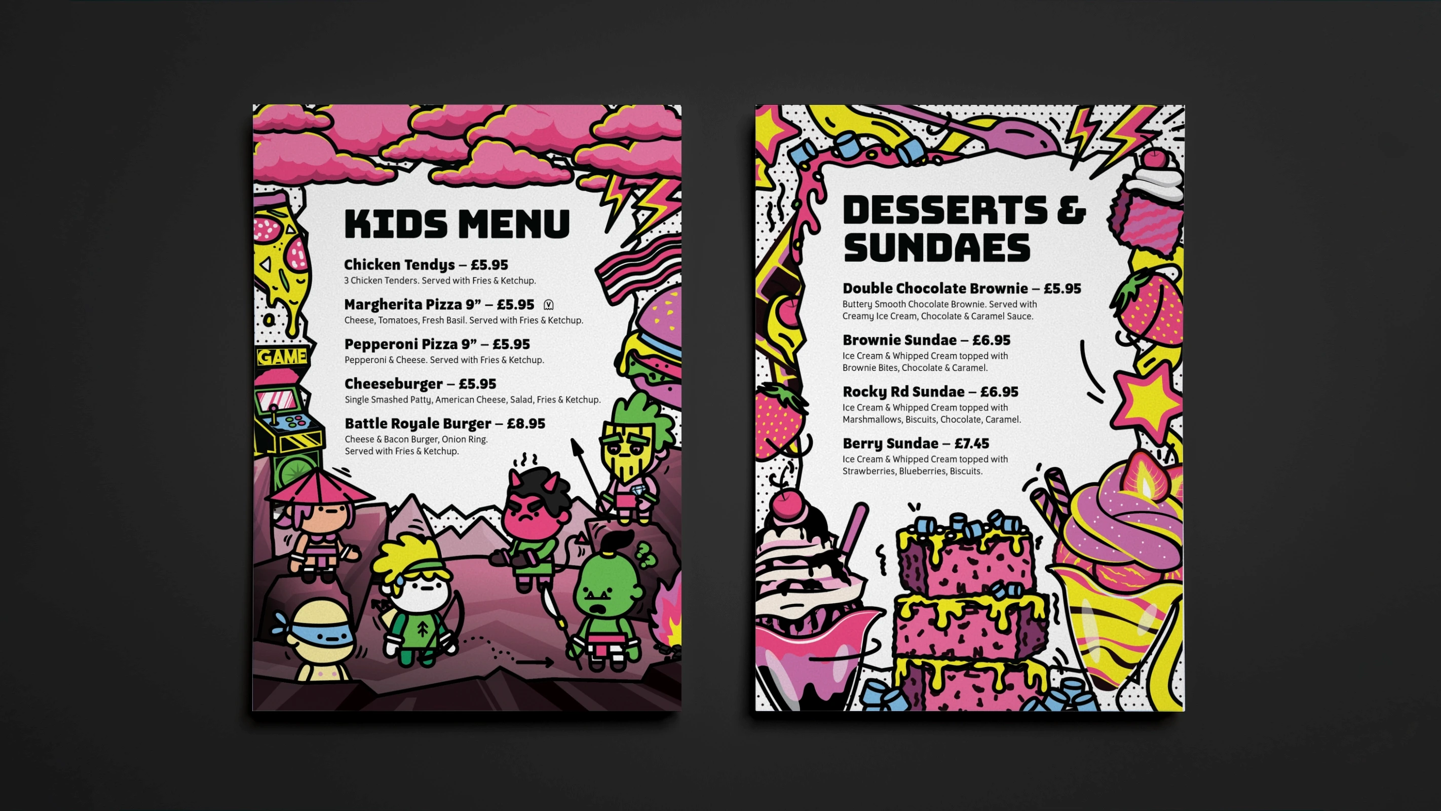
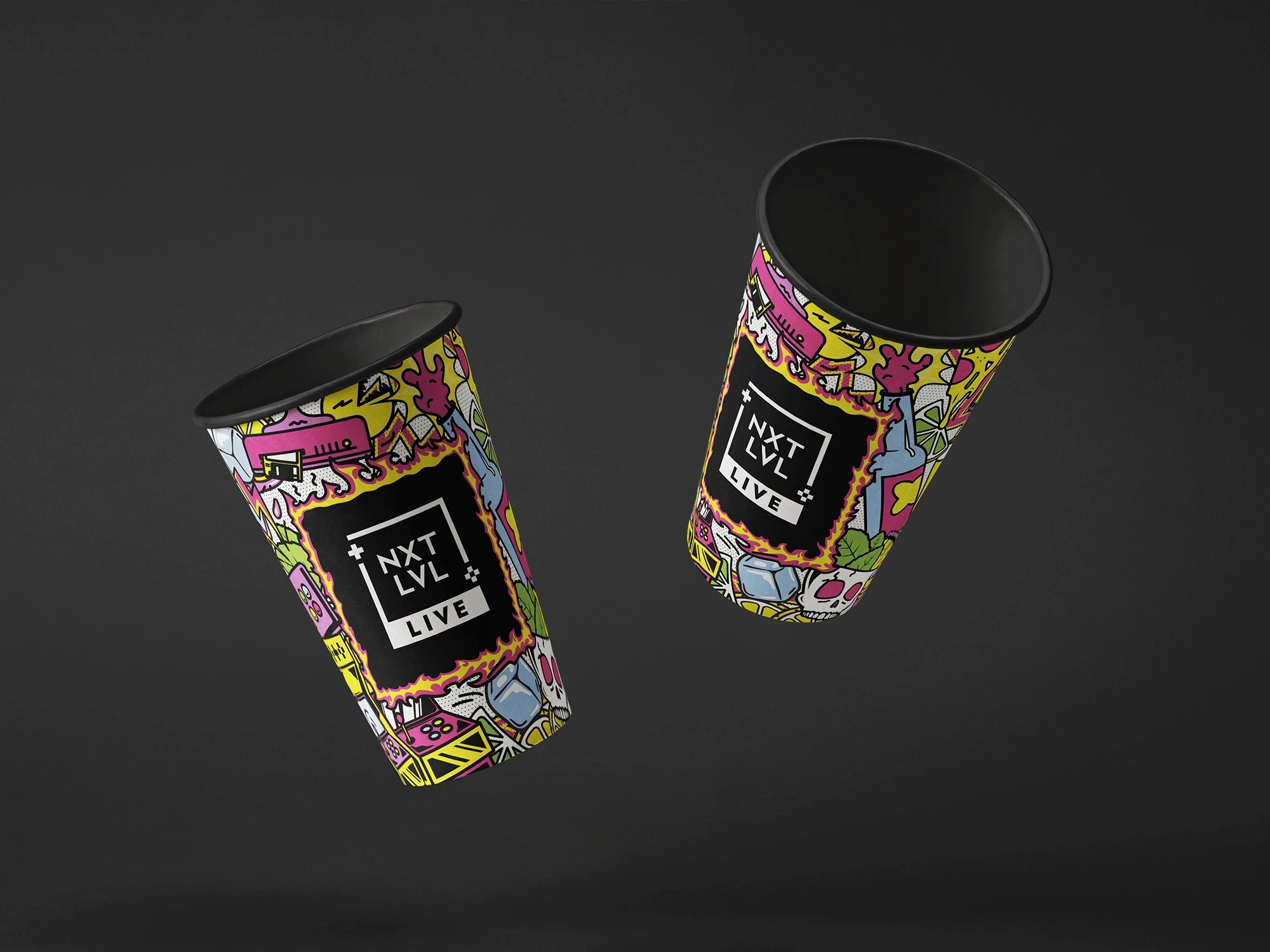
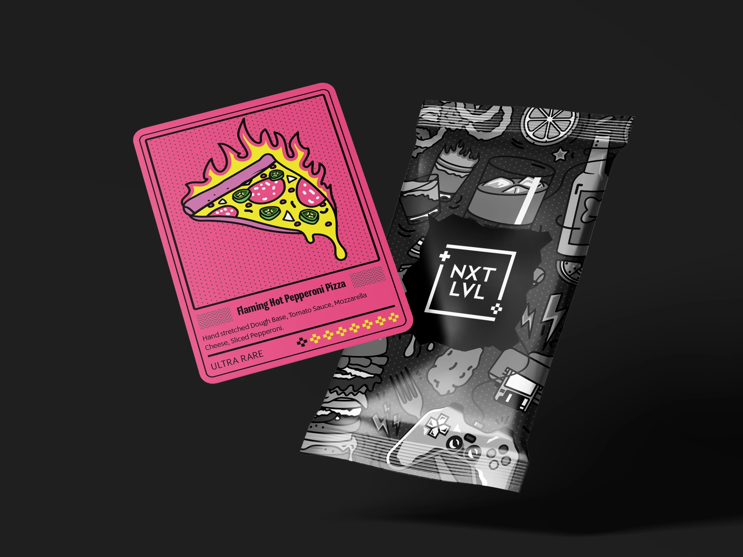
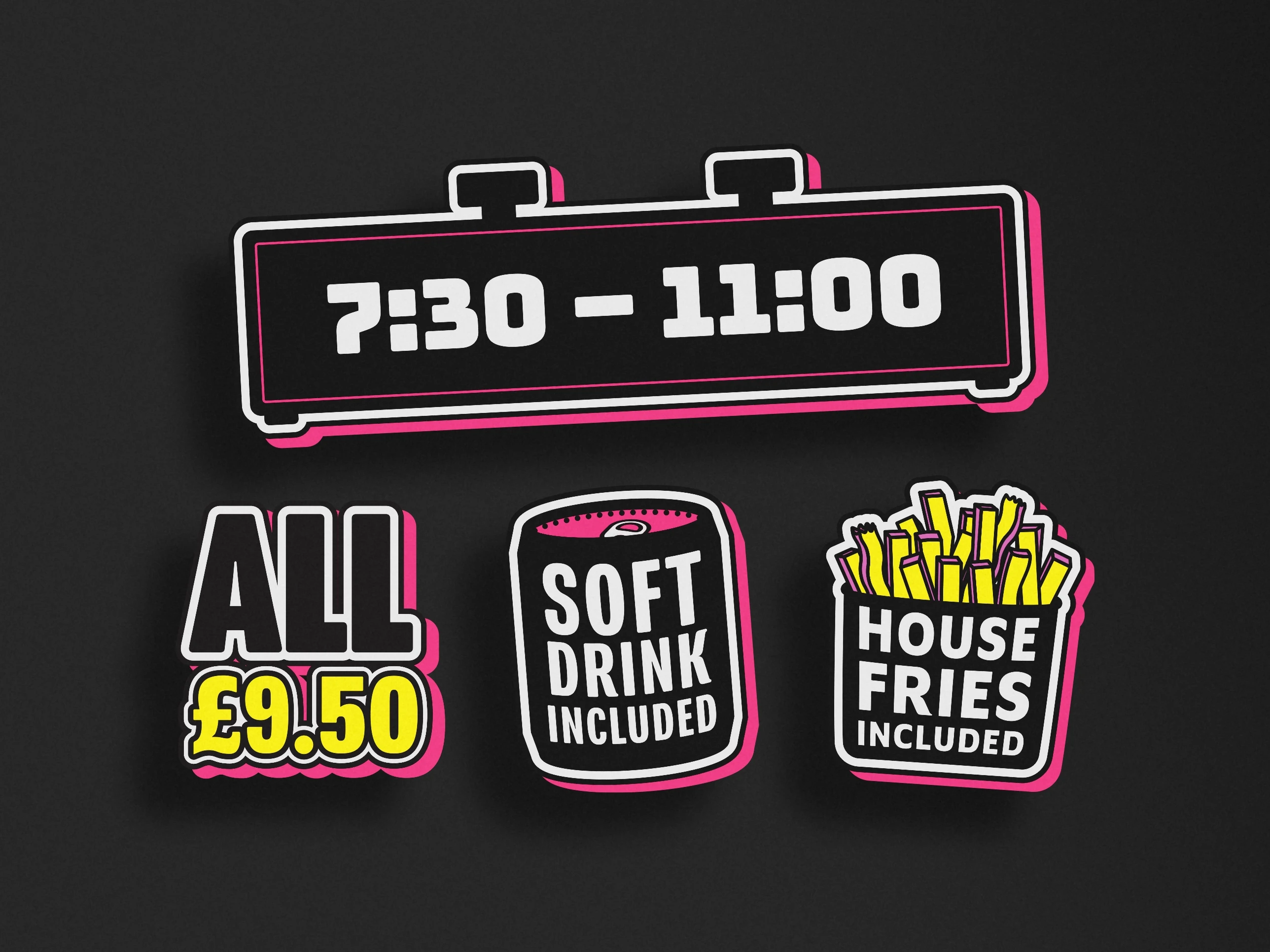
I moved away from the sharp, pixel-based graphics and introduced a more illustrative style inspired by classic comic books. Elements that were once rigid and geometric became more fluid, with bold outlines, exaggerated shapes and half-tone textures bringing greater personality to the brand.
TYPE
To support this direction, I paired the illustrations with Bungee, a typeface whose bold and unconventional letterforms reflected the same playful character found throughout the graphics. The result was a more cohesive identity that felt distinctive while remaining practical across menus, signage and social content.
COLOUR
The colour palette was inspired by the venue itself. Bright primary colours gave us the flexibility to illustrate everything from food and drinks to gaming-inspired graphics, while bold black outlines helped unify the artwork and create strong contrast throughout the identity.
Application
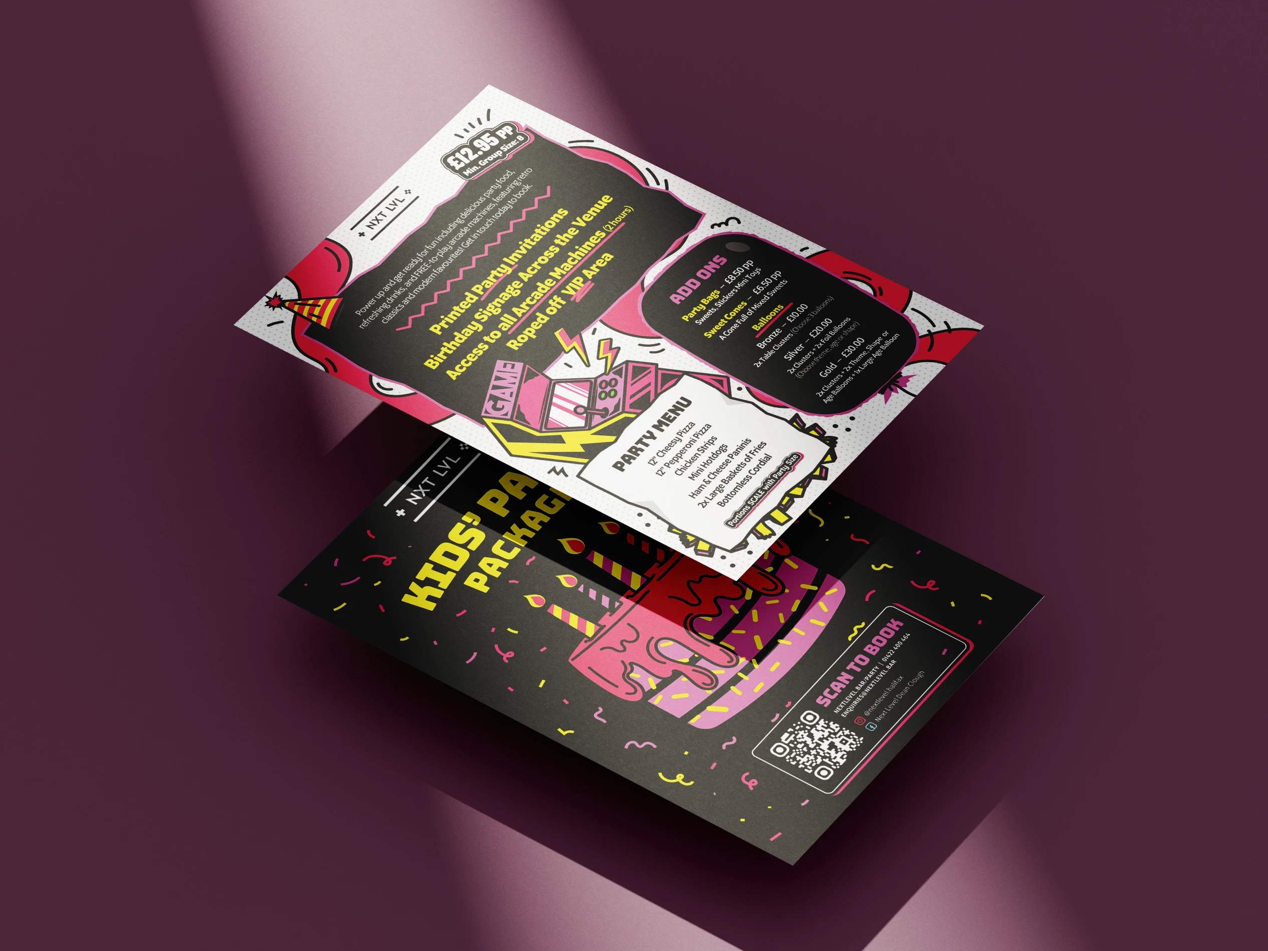
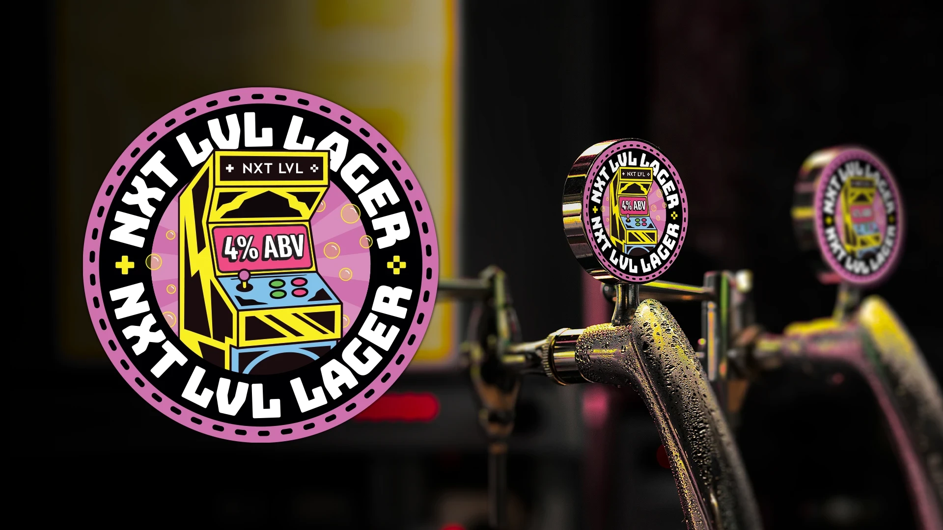
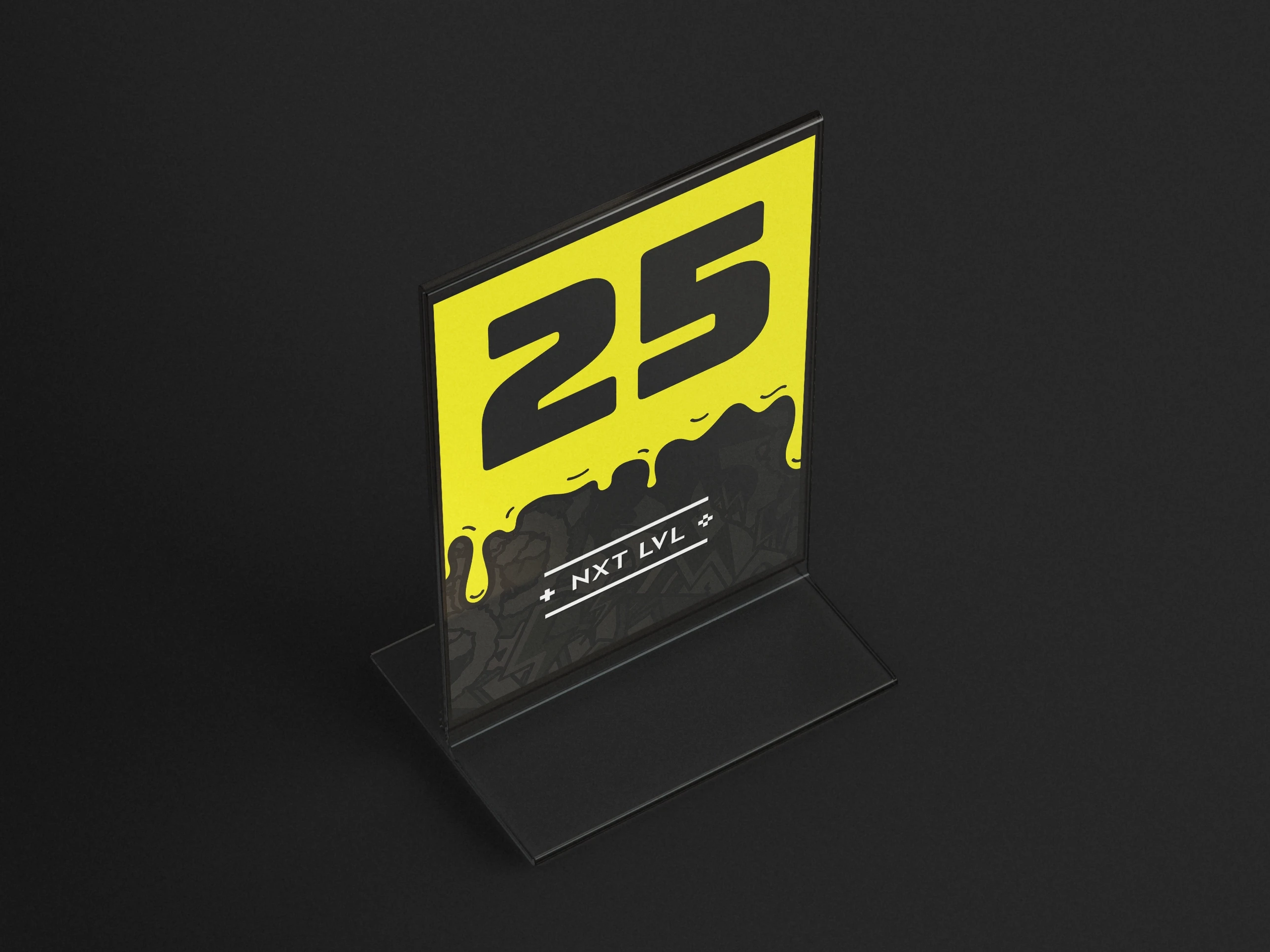
We applied the identity across key areas: menus, social posts, the website, outdoor signage, and in-venue details like table numbers and bathroom signs.
This new illustrative style gave us consistency and made it easy to create new assets quickly for promotions and seasonal campaigns.
Smooth Scroll
This will hide itself!
This will hide itself!
NXT LVL
OVERVIEW
NXT LVL is a retro arcade bar offering games, street style food and drinks. While the previous branding mainly focused on the arcade visuals, it left out the food, drinks and distinct personality. My role was to create a new visual identity that better reflected the bar's livelyness and vibrant menu offerings.
YEAR
2024
ROLE
GRAPHIC DESIGNER
RESPONSIBILITIES
VISAUL IDENTITY
PRINT DESIGN
ILLUSTRATION
About the project
GOAL
Create a more distinctive identity that reflects the atmosphere of the venue while moving away from a generic retro arcade aesthetic.
The new style also needed to remain flexible enough for frequent menu updates, seasonal promotions and marketing campaigns.
Visual direction
The new direction came from the bar’s partnership with TUMBS, an illustrator who had created a mural inside the venue.
GRAPHICS
I moved away from the sharp, pixel-based graphics and introduced a more illustrative style inspired by classic comic books. Elements that were once rigid and geometric became more fluid, with bold outlines, exaggerated shapes and half-tone textures bringing greater personality to the brand.
TYPE
To support this direction, I paired the illustrations with Bungee, a typeface whose bold and unconventional letterforms reflected the same playful character found throughout the graphics. The result was a more cohesive identity that felt distinctive while remaining practical across menus, signage and social content.
COLOUR
The colour palette was inspired by the venue itself. Bright primary colours gave us the flexibility to illustrate everything from food and drinks to gaming-inspired graphics, while bold black outlines helped unify the artwork and create strong contrast throughout the identity.
Application
We applied the identity across key areas: menus, social posts, the website, outdoor signage, and in-venue details like table numbers and bathroom signs.
This new illustrative style gave us consistency and made it easy to create new assets quickly for promotions and seasonal campaigns.
Smooth Scroll
This will hide itself!
This will hide itself!
NXT LVL
OVERVIEW
NXT LVL is a retro arcade bar offering games, street style food and drinks. While the previous branding mainly focused on the arcade visuals, it left out the food, drinks and distinct personality. My role was to create a new visual identity that better reflected the bar's livelyness and vibrant menu offerings.
YEAR
2024
ROLE
GRAPHIC DESIGNER
RESPONSIBILITIES
VISAUL IDENTITY
PRINT DESIGN
ILLUSTRATION
About the project
GOAL
Create a more distinctive identity that reflects the atmosphere of the venue while moving away from a generic retro arcade aesthetic.
The new style also needed to remain flexible enough for frequent menu updates, seasonal promotions and marketing campaigns.
Visual direction
The new direction came from the bar’s partnership with TUMBS, an illustrator who had created a mural inside the venue.
GRAPHICS
I moved away from the sharp, pixel-based graphics and introduced a more illustrative style inspired by classic comic books. Elements that were once rigid and geometric became more fluid, with bold outlines, exaggerated shapes and half-tone textures bringing greater personality to the brand.
TYPE
To support this direction, I paired the illustrations with Bungee, a typeface whose bold and unconventional letterforms reflected the same playful character found throughout the graphics. The result was a more cohesive identity that felt distinctive while remaining practical across menus, signage and social content.
COLOUR
The colour palette was inspired by the venue itself. Bright primary colours gave us the flexibility to illustrate everything from food and drinks to gaming-inspired graphics, while bold black outlines helped unify the artwork and create strong contrast throughout the identity.
Application
We applied the identity across key areas: menus, social posts, the website, outdoor signage, and in-venue details like table numbers and bathroom signs.
This new illustrative style gave us consistency and made it easy to create new assets quickly for promotions and seasonal campaigns.
Smooth Scroll
This will hide itself!
This will hide itself!