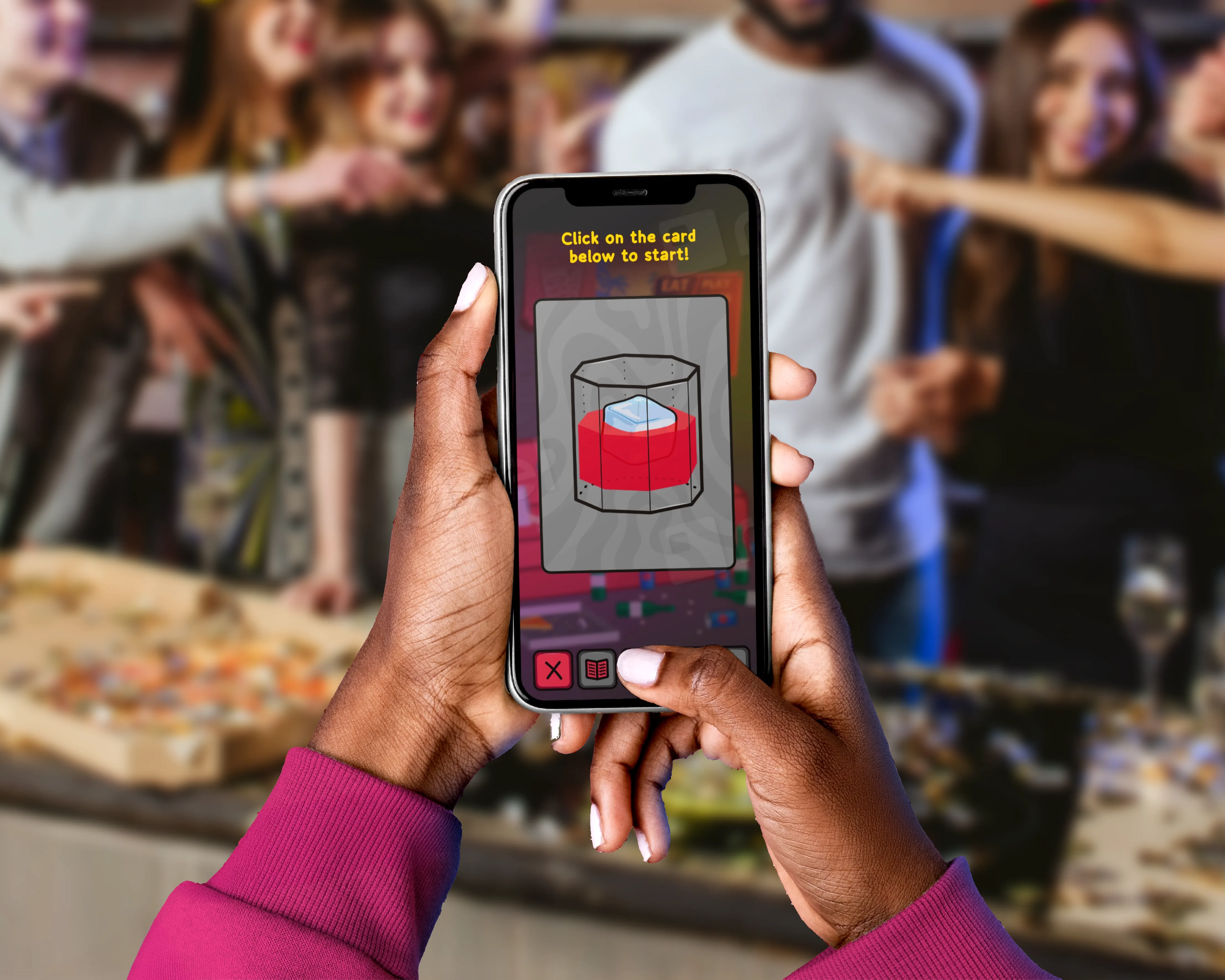
Topped Off is a party game designed to help students open up, have fun and get to know each other on a more personal level. As the designer, I created the visual identity, user interface and game illustrations. I took inspiration from nostalgic cartoons while keeping the overall style simple and approachable for a university audience.
YEAR
2023
ROLE
LEAD GRAPHIC DESIGNER
RESPONSIBILITIES
LOGO DESIGN
ILLUSTRATION
UI/UX DESIGN
About the project
GOAL
Create a fun, lighthearted game that encourages genuine conversations and breaks the ice in social gatherings.
SOLUTION
I started by creating a visual identity that felt welcoming and easy to engage with, helping remove some of the pressure often associated with meeting new people.
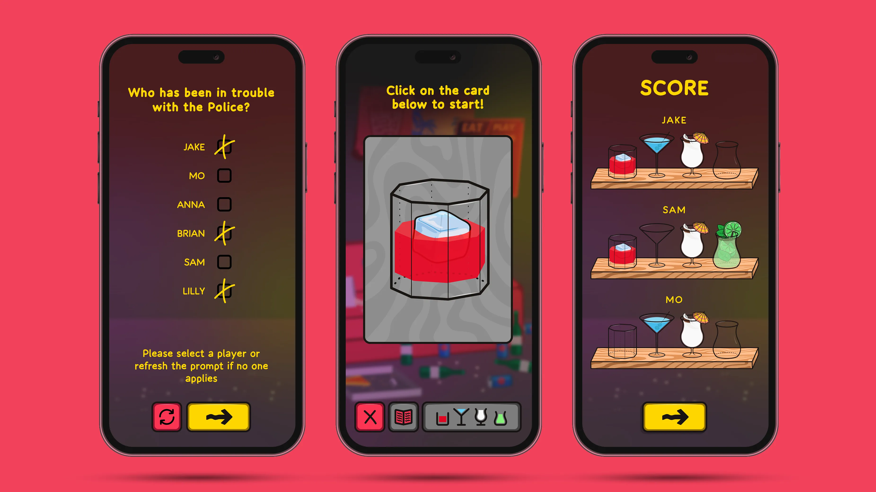
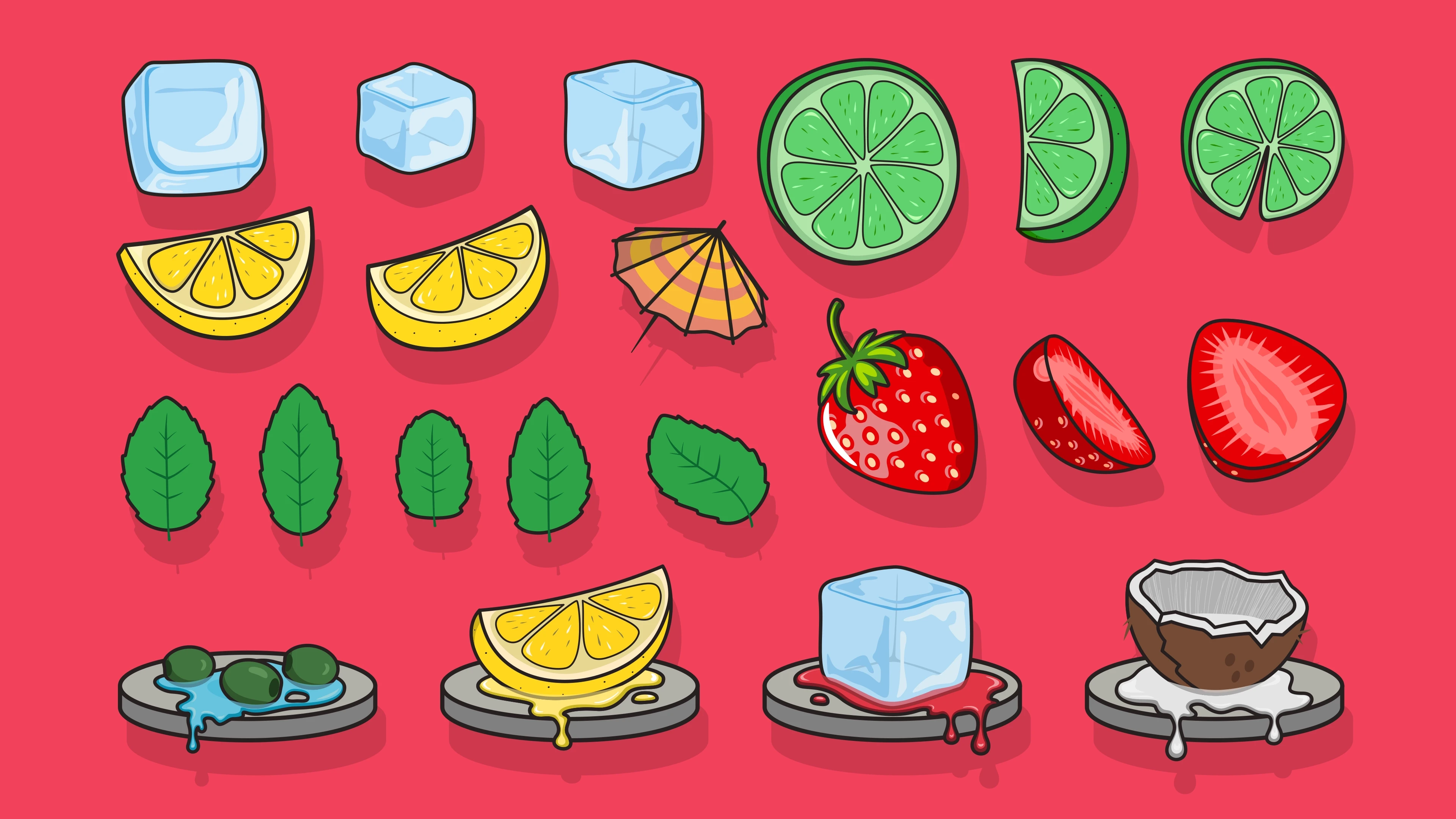
The game was then built around a series of challenge categories, each designed to encourage different types of interactions. To support this, I created a set of custom illustrations that helped players quickly recognise challenge types and navigate the game more easily.
Finally, I worked closely with a software developer throughout the project, adapting assets for mobile and learning how graphic design translates into a functional app.
Visual direction
TYPE
I chose the Sunbird typeface for its softer forms and strong legibility. Compared to more rigid typefaces, it helped make the game feel more approachable while remaining clear across mobile screens.
LOGO
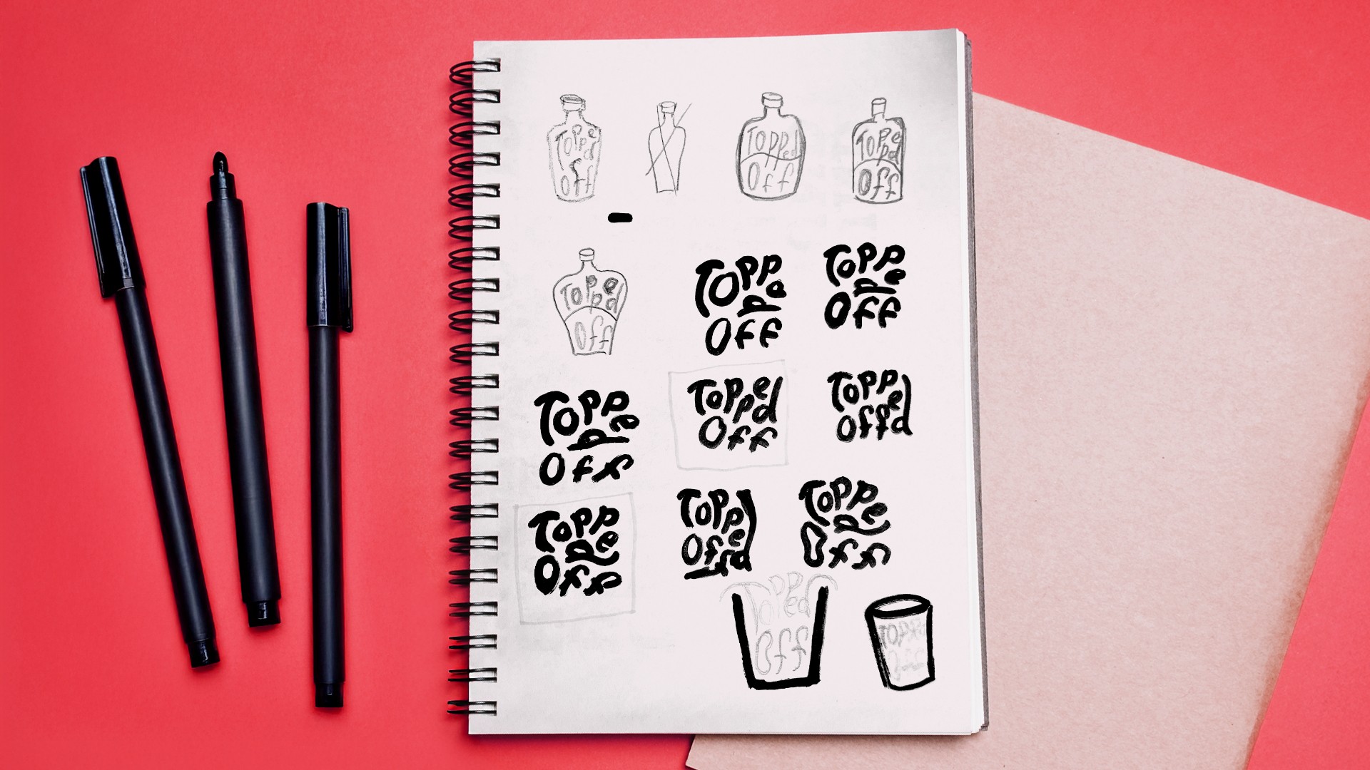
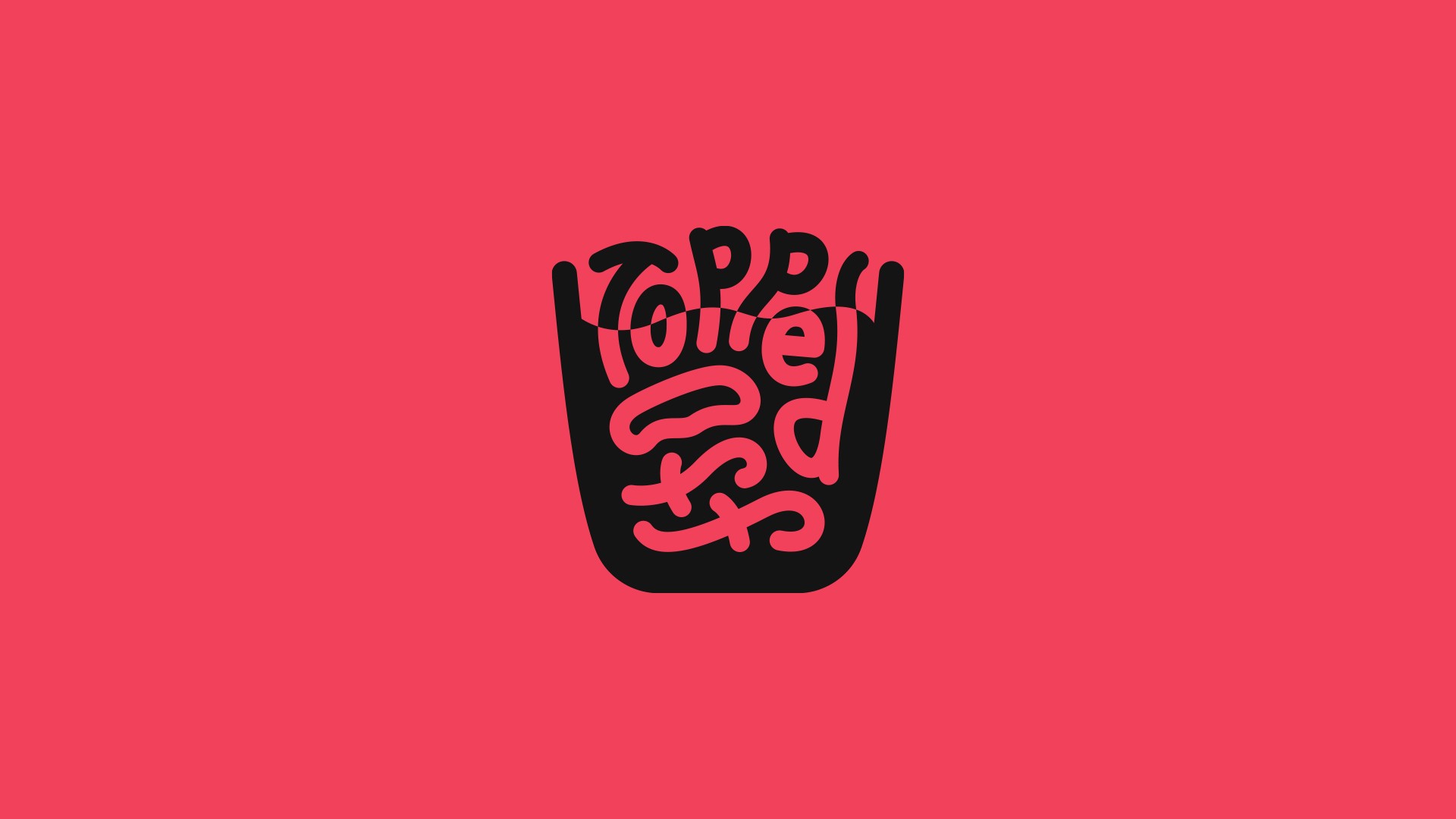
The logo was drawn from scratch rather than built from an existing typeface. I wanted the mark to communicate the game's theme immediately, so I integrated the lettering directly into a cocktail glass shape rather than relying on a separate icon. This approach created a more distinctive identity while reinforcing the social and drinking themes at the centre of the game.
COLOUR
The main red and yellow hues were chosen to evoke energy and urgency, fitting the fast-paced nature of the game. Neutral greys served as a visual anchor, ensuring the interface remained clear.
ILLUSTRATION
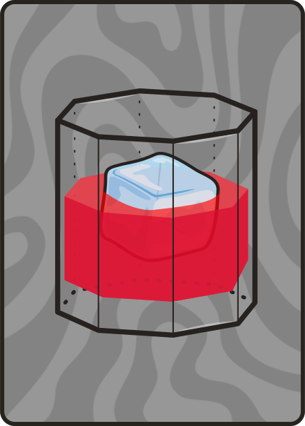
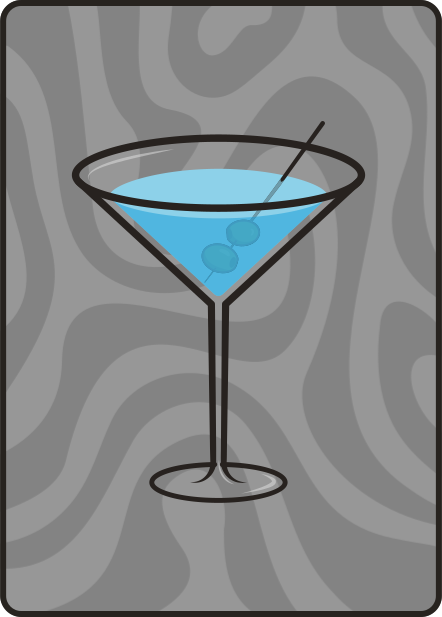
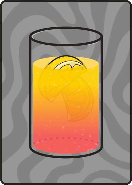
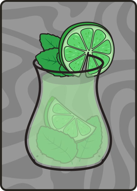
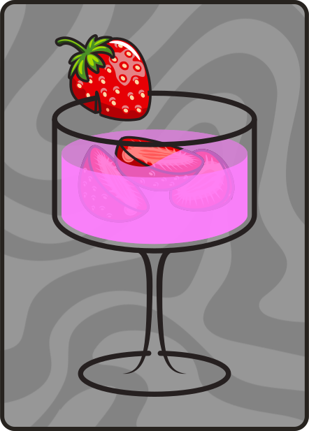
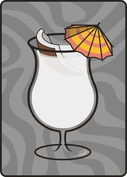
Each illustrated cocktail icon was designed to visually differentiate challenge categories. Smaller glass illustrations indicated tougher solo challenges, while larger cocktails represented group tasks. This tied the visual design directly to gameplay.
Application
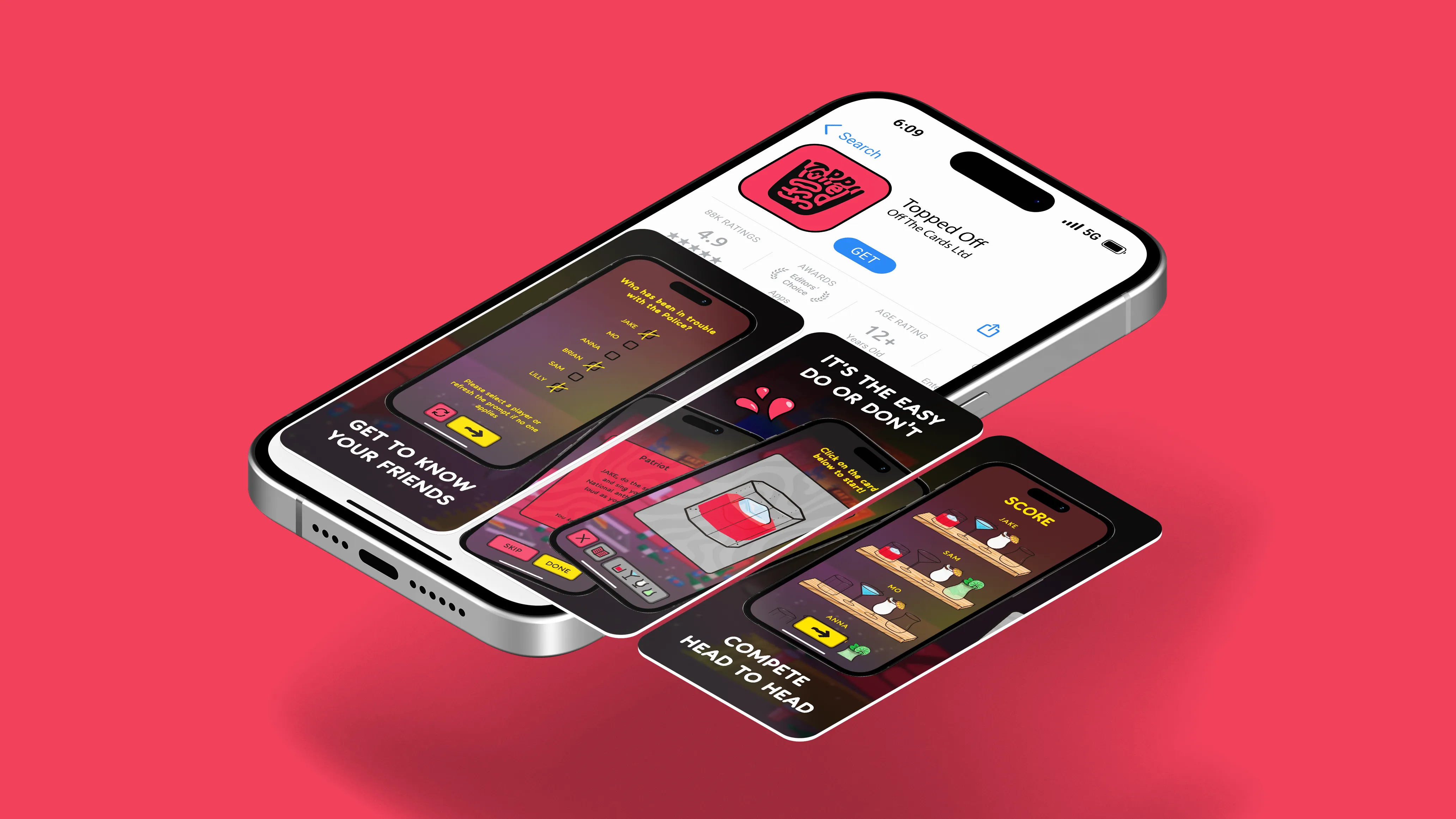
Applied across the app interface, App Stores and the Kickstarter campaign.
The identity helped communicate the game's personality before a player even started a challenge, while the visual structure made it easier to understand different categories and navigate the experience.
Smooth Scroll
This will hide itself!
This will hide itself!
OVERVIEW
Topped Off is a party game designed to help students open up, have fun and get to know each other on a more personal level. As the designer, I created the visual identity, user interface and game illustrations. I took inspiration from nostalgic cartoons while keeping the overall style simple and approachable for a university audience.
YEAR
2023
ROLE
LEAD GRAPHIC DESIGNER
RESPONSIBILITIES
LOGO DESIGN
ILLUSTRATION
UI/UX DESIGN
About the project
GOAL
Create a fun, lighthearted game that encourages genuine conversations and breaks the ice in social gatherings.
SOLUTION
I started by creating a visual identity that felt welcoming and easy to engage with, helping remove some of the pressure often associated with meeting new people.
The game was then built around a series of challenge categories, each designed to encourage different types of interactions. To support this, I created a set of custom illustrations that helped players quickly recognise challenge types and navigate the game more easily.
Finally, I worked closely with a software developer throughout the project, adapting assets for mobile and learning how graphic design translates into a functional app.
Visual direction
TYPE
I chose the Sunbird typeface for its softer forms and strong legibility. Compared to more rigid typefaces, it helped make the game feel more approachable while remaining clear across mobile screens.
LOGO
The logo was drawn from scratch rather than built from an existing typeface. I wanted the mark to communicate the game's theme immediately, so I integrated the lettering directly into a cocktail glass shape rather than relying on a separate icon. This approach created a more distinctive identity while reinforcing the social and drinking themes at the centre of the game.
COLOUR
The main red and yellow hues were chosen to evoke energy and urgency, fitting the fast-paced nature of the game. Neutral greys served as a visual anchor, ensuring the interface remained clear.
ILLUSTRATION
Each illustrated cocktail icon was designed to visually differentiate challenge categories. Smaller glass illustrations indicated tougher solo challenges, while larger cocktails represented group tasks. This tied the visual design directly to gameplay.
Application
Applied across the app interface, App Stores and the Kickstarter campaign.
The identity helped communicate the game's personality before a player even started a challenge, while the visual structure made it easier to understand different categories and navigate the experience.
Smooth Scroll
This will hide itself!
This will hide itself!
OVERVIEW
Topped Off is a party game designed to help students open up, have fun and get to know each other on a more personal level. As the designer, I created the visual identity, user interface and game illustrations. I took inspiration from nostalgic cartoons while keeping the overall style simple and approachable for a university audience.
YEAR
2023
ROLE
LEAD GRAPHIC DESIGNER
RESPONSIBILITIES
LOGO DESIGN
ILLUSTRATION
UI/UX DESIGN
About the project
GOAL
Create a fun, lighthearted game that encourages genuine conversations and breaks the ice in social gatherings.
SOLUTION
I started by creating a visual identity that felt welcoming and easy to engage with, helping remove some of the pressure often associated with meeting new people.
The game was then built around a series of challenge categories, each designed to encourage different types of interactions. To support this, I created a set of custom illustrations that helped players quickly recognise challenge types and navigate the game more easily.
Finally, I worked closely with a software developer throughout the project, adapting assets for mobile and learning how graphic design translates into a functional app.
Visual direction
TYPE
I chose the Sunbird typeface for its softer forms and strong legibility. Compared to more rigid typefaces, it helped make the game feel more approachable while remaining clear across mobile screens.
LOGO
The logo was drawn from scratch rather than built from an existing typeface. I wanted the mark to communicate the game's theme immediately, so I integrated the lettering directly into a cocktail glass shape rather than relying on a separate icon. This approach created a more distinctive identity while reinforcing the social and drinking themes at the centre of the game.
COLOUR
The main red and yellow hues were chosen to evoke energy and urgency, fitting the fast-paced nature of the game. Neutral greys served as a visual anchor, ensuring the interface remained clear.
ILLUSTRATION
Each illustrated cocktail icon was designed to visually differentiate challenge categories. Smaller glass illustrations indicated tougher solo challenges, while larger cocktails represented group tasks. This tied the visual design directly to gameplay.
Application
Applied across the app interface, App Stores and the Kickstarter campaign.
The identity helped communicate the game's personality before a player even started a challenge, while the visual structure made it easier to understand different categories and navigate the experience.
Smooth Scroll
This will hide itself!
This will hide itself!